

See how plumbers can turn Facebook scrollers into booked jobs with clear offers, local targeting, a 30 day test budget, fast follow up, and a path to scale.
How to Create Medical Landing Pages That Convert
A high-converting medical landing page does one thing: it moves a qualified patient from “I found this” to “I booked this” with as little friction as possible. The single-offer rule, ad-matched messaging, a frictionless booking path, and HIPAA-aware trust signals are not optional extras. They are the structure. Get those four right and the rest is refinement.
The short version, before you build anything:
- One offer, one page. “Free new patient knee consult” beats “Orthopedic Care | Sports Medicine | Physical Therapy” every time.
- Above the fold: benefit-led headline, one primary CTA, a short form or booking widget, and a trust strip (credentials, reviews, accreditations).
- Eligibility up front. Surface age limits, insurance restrictions, or geographic limits early. It filters bad leads before they waste your team’s time.
- Mobile-first, fast. Mobile traffic dominates healthcare content; a slow or cramped page loses patients before they read a word.
- Match the ad. If your Google Ads creative says “Same-week telehealth consult,” the headline on the page must say the same thing. Mismatch kills quality score and frustrates visitors.
- HIPAA applies to forms. Any vendor handling patient data needs a Business Associate Agreement (BAA).
- Track one conversion event. Call, booking completion, or form submit. Pick one and measure it from day one.
City Web Company’s approach: map every campaign to a single conversion event before a single pixel of design begins. That discipline alone separates pages that generate qualified leads from pages that generate traffic reports.
Table of Contents
Table of Contents
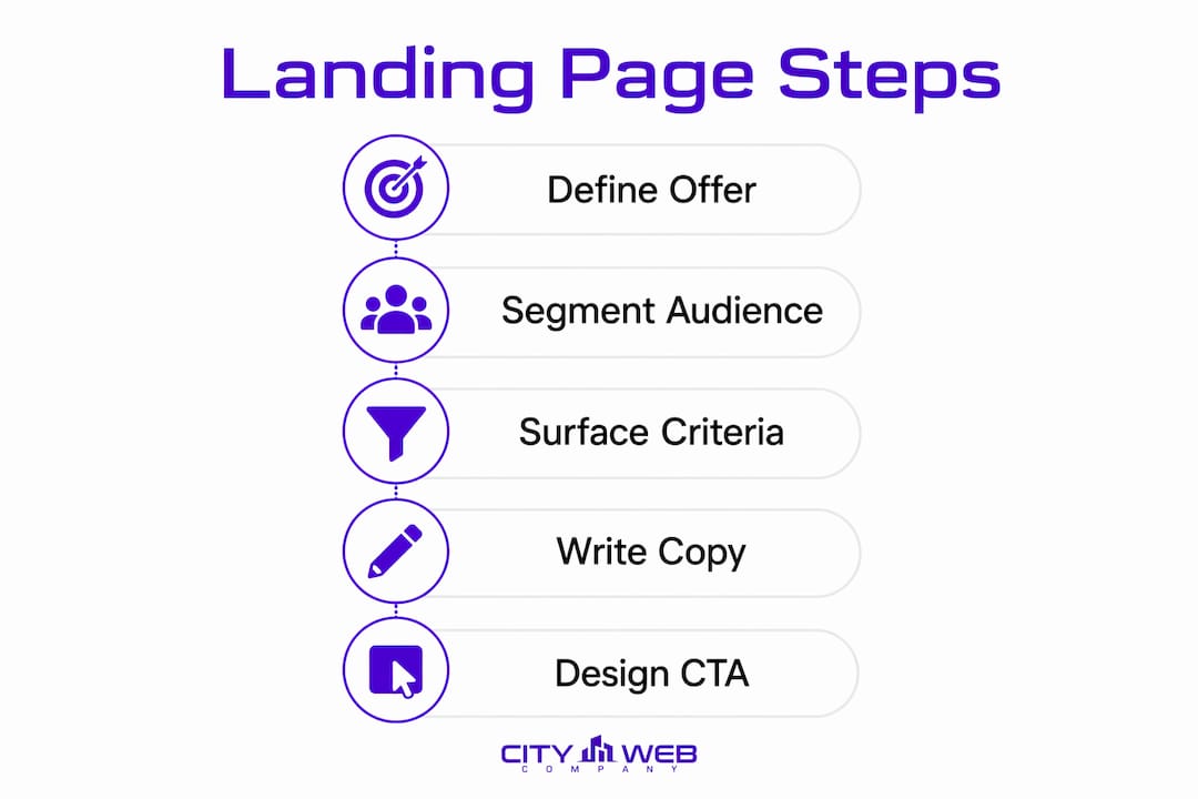
- Define Your Offer, Audience, and Acceptance Criteria Before You Build
- How to Write Copy That Reduces Patient Anxiety and Drives Bookings
- Design Patterns That Guide Patients Toward the Single Conversion Event
- How to Build HIPAA-Aware Forms and Scheduling Flows That Convert
- Where to Place Trust Signals and Consent Language on Medical Pages
- Technical SEO, Page Speed, and Analytics for Medical Landing Pages
- How to Test and Improve Medical Landing Pages Over Time
- Medical Landing Page Examples, Templates, and the Right Builder for Your Workflow
- City Web Company’s Process and a Practical Launch Checklist
- Pre-Launch QA Checklist: Is Your Page Ready for Traffic?
- Key Takeaways
- What Most Medical Landing Pages Get Wrong (and How to Fix It Fast)
- City Web Company Builds Medical Landing Pages That Generate Qualified Leads
- Useful Sources
- FAQ
Define Your Offer, Audience, and Acceptance Criteria Before You Build
The most common reason a medical landing page underperforms has nothing to do with design. It is a scope problem baked in before the first wireframe. Teams try to serve three patient types with one page, or they run a campaign for “general orthopedics” when the clinic’s actual open slots are for knee injections only.

Nail the single offer first
Pick one specific offer and name it plainly. “Free telederm consult for new patients” is a page. “Dermatology services” is a website section. The difference matters because a single offer lets you write a headline that matches the search query, a CTA that names the exact next step, and a form that collects only what the offer requires. Multi-offer pages force the visitor to self-select, and most won’t bother.

Two quick campaign-to-page examples:
| Ad Keyword | Headline | Offer | Primary CTA |
|---|---|---|---|
| “knee pain specialist near me” | Get Same-Week Relief for Knee Pain | Free new patient consult | Book My Free Consult |
| “telehealth dermatology” | See a Dermatologist This Week, From Home | Free telederm visit for new patients | Schedule My Visit |
Segment by intent, not by specialty
Symptom-search visitors (“my knee keeps locking up”) need reassurance and plain-language benefits. Procedure-search visitors (“PRP injection knee”) already know what they want and need logistics: cost, timeline, what to expect. Write for one intent per page. Trying to serve both on the same page usually means serving neither well.
Surface acceptance criteria early
Eligibility rules belong above the fold or immediately below it, not buried in fine print. If the offer is limited to patients within 50 miles, adults 18 and older, or those with specific insurance plans, say so. Proactively surfacing disqualifying attributes reduces patient frustration and improves conversion efficiency because the leads who do submit are far more likely to qualify.
Pre-build checklist
Before design begins, confirm these are documented:
- Analytics platform installed and conversion events defined (call click, form submit, booking completion)
- UTM parameters mapped to each ad campaign and ad group
- CRM routing rules: which form submissions go to which team member or intake queue
- Offer constraints documented: geographic limits, insurance, age, clinical restrictions
- One primary conversion event selected (not three)
Pro Tip: Connect your paid search campaigns to a dedicated landing page for each ad group, not to your homepage. One campaign, one page, one conversion goal.
How to Write Copy That Reduces Patient Anxiety and Drives Bookings
Copy is where most medical landing pages lose patients. Either the headline leads with the clinic’s name and credentials (nobody cares yet), or it makes a promise so vague it could apply to any practice in the country. Neither builds trust or drives action.

Lead with the outcome, not the technology
Patients search because something hurts, worries them, or is inconvenient. Write to that. “Stop living with knee pain” lands harder than “Advanced orthopedic care using the latest techniques.” Match the language of the search query that brought the visitor to the page. Ad keyword alignment improves relevance for both users and ad platforms, and it is increasingly critical as AI-driven search favors clear intent matching.
Above-the-fold copy structure
- Headline: Patient outcome or specific offer (8–12 words max)
- Subhead: One sentence that clarifies who this is for and what happens next
- Benefit bullets: Two to three lines, each starting with a patient-facing result (“No referral needed,” “Same-week appointments available,” “Covered by most major insurance”)
- Primary CTA: Action verb + specific next step (“Book My Free Consult,” not “Submit”)
What you cannot say (and why it matters)
Google Ads policies and FTC rules apply to both ad text and landing page copy. Avoid guaranteed outcomes (“We will cure your back pain”), superlatives without evidence (“The #1 orthopedic clinic in the state”), and before/after claims that imply typical results. If you cite a statistic, be prepared to source it. The safest frame is specific and honest: “Most patients see reduced pain within 4–6 weeks” is defensible. “We eliminate pain” is not.
CTA and microcopy examples for sensitive flows
- Telehealth consent note: “By booking, you agree to receive a secure video link at your provided email. Your information is never sold.”
- Eligibility note near CTA: “This offer is for new patients 18+ in [State]. Current patients, please call us directly.”
- Prescription disclaimer: “This page does not constitute a prescription or medical advice. A licensed provider will review your case.”
- Privacy microcopy near form submit: “We protect your information under HIPAA. No spam, ever.”
Pro Tip: Write your CTA label as the patient’s first-person action: “Book My Appointment” converts better than “Book an Appointment” because it reduces the psychological distance between reading and clicking.
Design Patterns That Guide Patients Toward the Single Conversion Event
Good medical landing page design is not about looking clinical or impressive. It is about reducing the number of decisions a visitor has to make before they book. Every visual element either moves them toward the CTA or distracts them from it.
Above-the-fold layout hierarchy
The best healthcare landing pages are mobile-first, highly scannable, and focused on one action. A reliable above-the-fold layout:
- Headline (largest text on the page, patient outcome)
- Subhead (who it’s for, what happens next)
- Primary CTA button (high contrast, thumb-friendly on mobile)
- Trust strip (logos: accreditations, insurance accepted, review stars)
- Brief benefit list (two to three bullets, not a paragraph)
Keep the secondary CTA (usually a phone number) visible but visually subordinate. Two equally prominent CTAs split attention and reduce clicks on both.
Image and video guidelines
Use real clinician photos when you have them. Stock photos of generic “doctors smiling” are immediately recognizable and erode trust. If you use procedure visuals, pair them with plain-language captions that explain what the patient will experience, not what the clinician is doing. Video works well for telehealth pages: a 60-second “here is what your visit looks like” clip reduces no-shows and increases booking confidence.
Accessibility and WCAG basics that protect conversions
Accessibility is not just a legal consideration under the ADA. It directly affects conversions:
- Color contrast: Minimum 4.5:1 ratio for body text, 3:1 for large text (WCAG AA standard)
- Font size: 16px minimum for body copy on mobile
- CTA button size: At least 44×44 pixels for touch targets
- Keyboard focus: All interactive elements must be reachable and visible via keyboard navigation
- Alt text: Every medical image needs descriptive alt text, both for screen readers and for image search indexing
- Form labels: Never use placeholder text as the only label; it disappears when the patient starts typing
Sticky CTAs and micro-interactions on mobile
A persistent booking button that follows the patient as they scroll is one of the highest-ROI additions to a mobile medical page. Keep it simple: one button, one label, fixed to the bottom of the viewport. Avoid animations or pop-ups that fire before the visitor has read the headline. They interrupt the trust-building sequence and increase bounce rates.
How to Build HIPAA-Aware Forms and Scheduling Flows That Convert
Forms are where conversions die. Too many fields, unclear labels, no privacy reassurance, and a submit button that says “Submit” are all conversion killers. In healthcare, there is an additional layer: the data you collect on a landing page may be protected health information (PHI), which means your form vendor needs to be HIPAA-compliant.
What to collect on the landing page vs. during intake
Landing page forms should collect the minimum needed to route and qualify the lead:
- First name, last name
- Phone number or email (phone-first for appointment-heavy practices)
- One qualifying question (insurance carrier, zip code, or chief complaint)
- Consent checkbox with brief privacy note
Everything else, including date of birth, full medical history, and insurance ID, belongs in the intake form after the appointment is confirmed. Asking for too much upfront is the single fastest way to increase form abandonment.
Progressive capture in practice
A two-step form flow works well for medical pages. Step one collects name and contact. Step two, shown after the patient clicks “Continue,” asks the qualifying question and surfaces the consent checkbox. This approach reduces the perceived burden of the form and lets you capture partial leads (patients who complete step one but not step two) for follow-up.
Scheduling flow options
- Embedded calendar widget: Best for practices with real-time availability. Patients book without a phone call. Works well for telehealth and elective procedures.
- Click-to-book (redirect to scheduling system): Keeps the landing page lean. Works when the scheduling platform is mobile-friendly and loads fast.
- Phone-first flow: Best for complex cases or high-value procedures where a staff member needs to qualify the patient before booking. The CTA is “Call to Schedule” with a click-to-call number.
HIPAA vendor checklist
Before you deploy any form or scheduling widget on a medical landing page:
- Confirm the vendor offers a signed BAA
- Verify data is encrypted in transit and at rest
- Check that form data is not shared with third-party ad platforms without explicit patient consent
- Review whether the vendor’s analytics integrations (Google Analytics, Meta Pixel) transmit PHI
Pro Tip: Standard Google Analytics 4 event tracking does not automatically comply with HIPAA. Work with your legal or compliance team before sending form field data or patient identifiers to any analytics platform. Server-side tagging can help isolate PHI from client-side scripts.
Where to Place Trust Signals and Consent Language on Medical Pages
Trust signals do not work if they are buried. A credential listed in the footer, a review widget that loads slowly, or a privacy policy linked only in the fine print all fail to do their job. Placement and timing matter as much as the signal itself.
Primary trust signals and where they go
- Clinician credentials and photos: Directly below the headline or in the hero section. Patients want to know who they are seeing before they book.
- Facility accreditations and certifications: In the trust strip immediately below the hero. Logos from recognized bodies (Joint Commission, NCQA, board certifications) carry weight.
- Patient reviews: One to three short, specific reviews placed near the primary CTA. “I got an appointment the same week and the doctor actually listened” is more persuasive than a star rating alone.
- Before/after outcomes: Use only when you have real, documented cases and the patient has given written consent. Never imply typical results.
- Practical visit details: Hours, what to bring, telehealth technical requirements. Surfacing these details upfront increases patient confidence and reduces no-shows.
Sample consent and privacy microcopy
Keep consent language scannable. One to two sentences near the submit button is enough for the landing page. Link to the full privacy policy and terms of service, but do not force the patient to read them before booking.
Regulatory touchpoints to know
- Google Ads policy: Prohibits misleading health claims, before/after imagery in some categories, and certain pharmaceutical terms. Review the Healthcare and Medicines policy before running ads.
- FTC truth-in-advertising: Requires that health claims be substantiated and that testimonials reflect typical results or be clearly labeled as individual experiences.
- HIPAA: Applies to any covered entity or business associate handling PHI. Forms, scheduling tools, and CRM systems that touch patient data all fall under this umbrella.
- Telehealth consent: Most states require explicit informed consent for telehealth visits. Surface a brief consent acknowledgment in the booking flow, not just in the post-booking email.
Technical SEO, Page Speed, and Analytics for Medical Landing Pages
A page that converts but cannot be found, tracked, or loaded quickly is not actually working. Technical hygiene on medical landing pages is straightforward, but it is frequently skipped in the rush to launch.
Tracking checklist
- Page-level events: CTA button click, form start, form submit, booking completion, phone number click
- UTM parameters on every paid traffic source (campaign, medium, source, content, term)
- Conversion goals configured in Google Analytics 4 and linked to Google Ads
- Test form submissions before launch to confirm CRM routing is correct
- Consider website uptime monitoring so a downed page does not silently drain ad spend
Page speed priorities for medical pages
- Compress all images to WebP format; hero images should be under 150KB
- Load critical CSS inline; defer non-critical stylesheets
- Lazy-load images below the fold
- Minimize third-party scripts (chat widgets, review embeds, analytics tags); each adds load time
- Use a CDN for static assets
A slow page does not just frustrate patients. It directly reduces Google Ads Quality Score, which raises your cost per click.
Schema markup worth adding
- LocalBusiness or MedicalOrganization: Helps Google understand the practice type, location, and contact information
- Event schema: Use for webinars, health screenings, or community events promoted via landing pages
- FAQPage schema: If the page includes a patient FAQ section, structured data can earn rich results in search
SEO basics for campaign pages
Match the page’s H1, meta title, and meta description to the primary campaign keyword. For a page targeting “telehealth dermatology consult,” all three should include that phrase or a close variant. Set a canonical tag if the page exists at multiple URLs. Confirm mobile-first indexing by testing in Google Search Console after launch.
For deeper guidance on healthcare SEO tactics that support organic discovery alongside paid campaigns, the approach is consistent: match intent, load fast, and earn trust signals that Google can read.
Pro Tip: CRM integration is not optional for medical pages. Route form submissions directly into your patient management system or CRM with a timestamp and source UTM. Speed of follow-up is one of the strongest predictors of lead conversion in healthcare.
How to Test and Improve Medical Landing Pages Over Time
A medical landing page is not a set-and-forget asset. The teams that consistently improve conversion rates treat their pages as living documents, running structured tests and reading behavioral data to find where patients hesitate or drop.
Testing priority order
Start where the most visitors make a decision, then work down the page:
- Headline and primary CTA: The highest-traffic elements. A single word change in a headline can shift conversion rates meaningfully.
- Form length and field order: Fewer fields almost always win, but test which qualifying question to keep.
- Trust signal placement and type: Test reviews near the CTA vs. in the hero; test credential photos vs. accreditation logos.
- Imagery: Real clinician photos vs. procedure visuals vs. patient-outcome imagery.
- Page length: Short single-screen vs. scrollable with FAQ and social proof.
Sample hypothesis template
Hypothesis: Changing the primary CTA label from “Submit” to “Book My Free Consult” will increase form submissions by reducing ambiguity about what happens next.
Test: A/B test, 50/50 traffic split, minimum two weeks or until statistical significance is reached.
Primary metric: Form submission rate.
Secondary metric: Booking completion rate (do submitted leads actually show up?).
Key metrics to track
- Conversion rate: Form submits or bookings divided by total page visitors
- Qualified lead rate: Leads that meet acceptance criteria divided by total leads
- Booking completion rate: Confirmed appointments divided by booking requests
- Cost per acquisition: Total ad spend divided by confirmed appointments
Behavioral analytics: what to look for
Use heatmaps and session replay tools to identify where patients scroll to, where they hesitate, and where they exit. Common findings on medical pages: patients scroll past the form to look for pricing or insurance information before committing, and they frequently re-read the eligibility note before clicking the CTA. Both are signals to surface that information higher on the page.
Testing in healthcare contexts often means smaller sample sizes than e-commerce. Run tests for at least two weeks to account for day-of-week variation, and be cautious about declaring a winner on fewer than a few hundred conversions. Seasonality matters too: a flu-season campaign page will behave differently in January than in July.
For a broader framework on improving website conversion rates, the same principles apply: test the highest-traffic decision points first, measure qualified outcomes not just clicks, and iterate continuously.
Medical Landing Page Examples, Templates, and the Right Builder for Your Workflow
The fastest way to build a high-converting medical landing page is to start from a template designed for the use case, then adapt it for your offer, compliance requirements, and patient audience. The builder you choose determines how fast you can test, how easily you can integrate with your CRM, and how much technical support you need.
What to copy from high-converting medical pages
Real-world examples highlight consistent patterns worth replicating:
- Trust strip placement: Immediately below the hero, before the body copy. Logos of insurance carriers accepted, accreditations, and review stars.
- CTA sequence: Primary CTA in the hero, repeated after the first benefit section, and again after social proof. Three placements, same label.
- FAQ section: Short, patient-question format (“Do I need a referral?” “Is this covered by insurance?”). Reduces pre-booking anxiety and improves time on page.
- Privacy microcopy: One sentence near the form, linked to the full privacy policy.
Builder comparison for medical campaigns
Each of these platforms gets recommended for specific workflows. None is universally best; the right choice depends on your team’s technical comfort, your CRM, and your compliance requirements.
Landingi is a strong starting point for clinics that need healthcare-specific templates and want to move fast. Its AI-assisted layout generation can produce a hero section, trust strip, and booking widget from a short campaign prompt, though every output needs human review for compliance before going live.
ConvertFlow is built around multi-step forms and personalization flows, which makes it well-suited for progressive capture and patient segmentation. It integrates with most major CRMs and is worth evaluating for practices that want to route leads differently based on qualifying answers.
Unbounce is a reliable choice for teams running multiple paid campaigns simultaneously. Its Smart Traffic feature automatically routes visitors to the variant most likely to convert, which is useful when you are testing headline or offer variations across a campaign.
Instapage targets higher-volume advertising teams and offers collaboration tools that work well when a marketing team, a compliance reviewer, and a clinician all need to approve a page before launch. Its AdMap feature connects ad groups directly to landing page variants.
Elementor (WordPress) gives the most design flexibility and is a practical option for practices that already run WordPress sites and want landing pages that match their main site’s branding. HIPAA-compliant form plugins are available but require separate configuration.
HubSpot landing pages are the natural choice when the practice already uses HubSpot CRM. Form submissions route directly into the contact record, workflows trigger follow-up sequences automatically, and A/B testing is built in. The trade-off is that HubSpot’s page builder is less flexible than dedicated landing page tools.
Pro Tip: AI-generated layouts from tools like Landingi can cut build time significantly, but always run the copy through a compliance review before launch. AI tools do not know your state’s telehealth consent requirements or your clinic’s specific insurance restrictions.
Starter block checklist for any builder
- Hero block: headline, subhead, primary CTA, hero image or video
- Trust strip: accreditation logos, review stars, insurance logos
- Benefit section: three to four patient-outcome bullets with icons
- Booking module: embedded calendar or short form with privacy microcopy
- Social proof: two to three patient reviews with first name and condition treated
- FAQ block: four to six short questions with plain-language answers
- Footer: privacy policy link, terms link, practice address and phone
City Web Company’s Process and a Practical Launch Checklist
How the agency approach works in practice
City Web Company’s documented process for local service clients, including medical practices and med spas, follows a consistent structure: define the single conversion event first, build the page around that event, and measure qualified outcomes rather than raw traffic. The case studies on the City Web Company local landing pages page show the pattern: a focused offer, a matched ad campaign, and a page built to convert one type of patient.
A representative project structure looks like this:
- Objective: Increase new patient bookings for a specific procedure or service line
- Constraints: HIPAA-compliant form vendor, Google Ads healthcare policy compliance, mobile-first build
- Offer: One specific service with a clear CTA (free consult, same-week appointment, telehealth visit)
- Changes made: Replaced multi-service homepage with a dedicated campaign page, simplified form to three fields, added clinician photo and credential strip above the fold, surfaced insurance and eligibility notes
- Metrics tracked: Form submission rate, qualified lead rate, booking completion rate, cost per acquisition
Downloadable checklist by phase
Plan:
- Single offer defined and documented
- Acceptance criteria and disqualifying attributes listed
- Analytics platform and conversion events configured
- UTM structure mapped to ad campaigns
- CRM routing rules confirmed
Build:
- Page built in chosen platform with mobile-first layout
- Form vendor BAA confirmed
- Privacy microcopy and consent language in place
- All images compressed and alt text added
- Schema markup added (LocalBusiness or MedicalOrganization)
Test:
- Test form submission confirms CRM routing
- All tracking events fire correctly in Google Tag Manager
- Page loads in under three seconds on mobile (test with Google PageSpeed Insights)
- Accessibility check: color contrast, keyboard navigation, font size
- Ad creative and landing page headline match confirmed
Launch:
- Soft launch with limited traffic for the first 72 hours
- Monitor conversion events and form routing in real time
- Confirm no PHI is passing to client-side analytics scripts
Measure and iterate:
- Weekly review of conversion rate, qualified lead rate, and cost per acquisition
- First A/B test launched within two weeks of initial data collection
- Behavioral analytics review (heatmap, session replay) at 30 days
4–6 week timeline template
| Week | Milestone |
|---|---|
| 1 | Offer definition, audience segmentation, acceptance criteria, analytics plan |
| 2 | Copy draft, design wireframe, form vendor BAA confirmation |
| 3 | Page build, tracking setup, CRM integration, compliance review |
| 4 | QA, accessibility check, ad creative alignment, soft launch |
| 5–6 | Data collection, first A/B test, behavioral analytics review, iteration |
Pre-Launch QA Checklist: Is Your Page Ready for Traffic?
Run through this list before you scale paid spend. One missed item can mean wasted budget or a compliance problem.
- Privacy microcopy is visible near the form submit button and links to the full privacy policy.
- Form vendor BAA is signed and on file.
- Page loads in under three seconds on a mobile device (verified with Google PageSpeed Insights or GTmetrix).
- Color contrast meets WCAG AA (4.5:1 for body text).
- All form fields have visible labels (not just placeholder text).
- Test form submission routes correctly to CRM with source UTM attached.
- All tracking events fire in Google Tag Manager preview mode: CTA click, form start, form submit, phone click.
- Ad headline and landing page headline match (same offer, same language).
- Eligibility and disqualifying criteria are visible above the fold or immediately below it.
- Telehealth consent language is present in the booking flow if applicable.
- Canonical tag is set if the page exists at more than one URL.
- Schema markup (LocalBusiness or MedicalOrganization) is validated in Google’s Rich Results Test.
- Soft launch plan is documented: traffic cap for first 72 hours, team member assigned to monitor.
- Recovery plan is ready: know how to pause ads and revert to a previous page version if a critical issue appears.
- All images have descriptive alt text.
Key Takeaways
A high-converting medical landing page is built on one offer, matched ad intent, and a frictionless path to booking, with HIPAA-aware trust signals and ongoing testing as non-negotiable foundations.
| Point | Details |
|---|---|
| Single-offer rule | One page, one offer, one CTA. Multi-offer pages split attention and reduce conversions. |
| Surface eligibility early | Disqualifying criteria above the fold filter bad leads before they reach your intake team. |
| HIPAA applies to forms | Confirm your form and scheduling vendor has a signed BAA before collecting any patient data. |
| Test headline and CTA first | Start A/B testing at the highest-traffic decision points; measure qualified leads, not just clicks. |
| City Web Company’s approach | City Web Company builds campaign-specific landing pages with CRM integration and conversion tracking for local medical practices. |
What Most Medical Landing Pages Get Wrong (and How to Fix It Fast)
The pattern City Web Company sees repeatedly across medical practice clients is not a design problem. It is a scope problem dressed up as a design problem. A practice runs a Google Ads campaign for a specific procedure, sends traffic to a page that lists every service the clinic offers, and then wonders why the cost per lead is high and the lead quality is low. The fix is not a redesign. It is a redirect to a page that does one thing.
The second most common mistake is treating compliance as a final-step checkbox. Practices build the page, write the copy, and then ask a compliance reviewer to “look it over” before launch. That sequence almost always results in last-minute rewrites, delayed launches, and copy that is technically compliant but reads like a legal document. Compliance thinking belongs in the copy brief, not the QA phase. When you write “most patients see improvement within four to six weeks” instead of “we will eliminate your pain,” you are not just protecting yourself legally. You are writing something a skeptical patient will actually believe.
The third mistake is underestimating how much eligibility disclosure improves lead quality. Practices worry that surfacing insurance restrictions or geographic limits will reduce form submissions. It does reduce submissions, and that is the point. A smaller number of qualified leads is worth more than a large number of unqualified ones. The intake team’s time is finite, and every call spent disqualifying a patient who was never going to book is a call not spent converting one who was.
The balance between compelling and compliant is not as difficult as it looks. Write to the patient’s outcome, be specific about what the offer includes and excludes, and let the clinical honesty do the trust-building work that no amount of stock photography can do.
City Web Company Builds Medical Landing Pages That Generate Qualified Leads
Medical practices running paid campaigns deserve more than a generic landing page template. City Web Company builds campaign-specific landing pages for local clinics, med spas, and healthcare practices, with the full stack: local SEO, Google Ads management, mobile-first web design, ADA accessibility compliance, and CRM integration so leads route to the right person immediately.

The process starts with a discovery call where City Web Company maps your campaign goal to a single conversion event, reviews your current ad creative and landing page, and identifies the fastest path to qualified leads. From there, the team handles copy, design, tracking setup, and compliance review, typically delivering a launch-ready page within the four-to-six-week timeline outlined above.
If you are running paid search for a medical practice and your cost per qualified lead is higher than it should be, the landing page is usually where the problem lives. See what City Web Company’s digital marketing services can do for your practice, or get started directly at the local leads page.
Useful Sources
- Healthcare Landing Pages That Convert in 2026 | OuterBox: Covers ad keyword alignment, FTC and Google Ads compliance, eligibility disclosure, and testing priorities for medical pages.
- Healthcare Landing Page Best Practices | Landingi: Best practices and AI-assisted build workflows for healthcare-specific landing pages, with template examples.
- 13 Healthcare Landing Page Best Practices | Landingi: Expanded checklist of conversion-focused best practices for healthcare marketers.
- Best Healthcare Landing Pages and Why They Work | Health Union: Annotated examples showing trust signal placement, CTA structure, and mobile-first design patterns.
- Medical Landing Page Examples and Templates | ConvertFlow: Template library and multi-step form examples for medical campaigns.
- Healthcare Landing Page Examples for Design Inspiration | SaaS Landing Page: Visual gallery of real healthcare landing pages for layout and trust signal inspiration; adapt all copy for compliance.
- City Web Company Local Landing Pages Case Studies: Agency-documented results for local service clients, including medical practices.
- Why Optimize Healthcare Websites: A 2026 Guide | City Web Company: Broader context on healthcare website performance and optimization approaches.
- Online Advertising in Healthcare | City Web Company: How paid search and behavioral data inform landing page optimization and patient acquisition.
FAQ
What is the best tool to create a medical landing page?
The best tool depends on your workflow. Landingi and Unbounce work well for fast campaign launches with healthcare templates; HubSpot is the strongest choice if you already use HubSpot CRM; Instapage suits larger teams that need compliance review collaboration. All require HIPAA-compliant form configuration before collecting patient data.
What is the best website builder for healthcare?
For healthcare practices, Elementor on WordPress offers the most design flexibility and integrates with HIPAA-compliant form plugins, while HubSpot provides the tightest CRM-to-landing-page connection for practices focused on lead nurturing. The right choice depends on whether you prioritize design control, CRM integration, or speed of launch.
How many fields should a medical landing page form have?
Limit the landing page form to three to four fields: name, contact information, and one qualifying question. Collect detailed clinical information during the intake process after the appointment is confirmed, not before.
Does HIPAA apply to medical landing page forms?
Yes. Any form on a medical landing page that collects patient information from a covered entity or its business associates is subject to HIPAA. The form vendor must sign a BAA, and data must be encrypted in transit and at rest.
How do you improve conversion rates on healthcare landing pages?
Start by testing the headline and primary CTA label, then reduce form fields to the minimum needed to qualify the lead. Surface eligibility criteria early to filter unqualified submissions, and confirm that the page headline matches the ad creative that drove the visit. Behavioral analytics and A/B testing are the most reliable tools for ongoing improvement.
Recommended
These articles were popular with other readers too: