

Pass Google Business verification with a video-first checklist. Film one continuous 30 second take, fix flagged issues, and know when to hire help.
Website Accessibility Guide: What to Fix First and Why
Target WCAG 2.2 Level AA, run an automated scan today, and fix your top ten flagged issues before doing anything else. That single sequence, backed by keyboard testing and a screen reader pass, resolves more legal exposure and usability friction than any other move you can make this week.
Automated tools like axe and WAVE catch obvious problems fast: missing alt text, low contrast, empty links. They will not catch everything. WebAIM’s evaluation research shows automated tools flag only a minority of real accessibility issues, which is exactly why the fix-first, test-deeper approach matters more than chasing a perfect scanner score.
The websites that get sued are rarely the ones with an accessibility statement and a testing plan. They’re the ones that never looked.
Here’s the immediate sequence, in order:
- Run a free automated scan with axe or WAVE on your homepage, your top landing pages, and your checkout or contact flow using this technical SEO audit checklist to ensure accessibility fits into broader site health assessments.
- Fix the highest-impact issues first: color contrast failures, missing form labels, and keyboard traps.
- Publish a short accessibility statement naming your conformance target and a contact method for complaints.
- Schedule a manual keyboard-only test and a screen reader pass with NVDA or VoiceOver within two weeks.
- Assign an owner. Someone on your team, or your agency, needs to be accountable for this past launch day.
For a 30/60/90-day starter plan:
- Days 1 to 30: automated scan, critical fixes on your home page and highest-traffic conversion paths, statement published.
- Days 31 to 60: manual keyboard and screen reader testing across your full site, template-level fixes rolled out.
- Days 61 to 90: user testing with people who rely on assistive technology, documentation updated, retest cycle scheduled.
Table of Contents
Key Takeaways
Making a website accessible requires targeting WCAG 2.2 Level AA, running automated and manual tests together, and assigning permanent ownership past initial launch.
| Point | Details |
|---|---|
| Target WCAG 2.2 AA | Build to Level AA as your working standard, since it aligns with ADA guidance and exceeds the Section 508 floor. |
| Layer your testing | Combine automated scans with keyboard checks, screen reader testing, and real user testing to catch what tools miss. |
| Automated tools catch a minority | Scanners like axe and WAVE detect only a minority of issues; manual testing finds the rest. |
| Fix by principle, not by page | Organize remediation around Perceivable, Operable, Understandable, and Robust to avoid missing whole categories. |
| Get expert help when scope grows | City Web Company audits, prioritizes, and rolls accessibility fixes into your design system for multi-page or multi-location sites. |
Table of Contents
- Why Website Accessibility Guide Priorities Matter for Users and Your Business
- Which Standards and Laws Govern Website Accessibility?
- What Are the Most Common Accessibility Barriers on Websites?
- How Do You Make Website Content Accessible? The POUR Framework
- How Should You Test a Website for Accessibility?
- What Should a Website Accessibility Remediation Timeline Look Like?
- How Do You Write an Accessibility Statement?
- What Resources Should You Bookmark for Website Accessibility?
- How Does City Web Company Approach Accessibility Projects?
- Why Treat Accessibility as Foundational, Not Optional Polish
- Get Help Making Your Website Accessible and Compliant
- Sources
- FAQ
Why Website Accessibility Guide Priorities Matter for Users and Your Business
Accessibility isn’t a checkbox exercise. It’s the difference between a website that works for everyone and one that quietly locks out a portion of the people trying to buy from you, apply to you, or read what you published.
Start with the human case, because it’s the one most business owners skip past. Screen reader users, people with low vision, people who navigate by keyboard alone because of motor impairments, and aging users with declining vision or hearing all depend on the same set of design decisions you’re making anyway. Get those decisions right once and you serve all of them simultaneously.
The usability payoff extends well past assistive technology users. Nielsen Norman Group has long argued that accessibility heuristics overlap directly with general usability principles like consistency, clear error messages, and forgiving navigation. A site that’s easier for a screen reader to parse is usually easier for a distracted mobile user to parse too. Clean heading structure and descriptive link text tend to correlate with better search visibility and conversion rates, since both search crawlers and assistive technology read your markup the same structural way.
Fix accessibility and you’re often fixing usability and SEO at the same time, without a separate project for each.
Then there’s legal exposure, and it’s not theoretical. Federal guidance published on Ada lays out practical expectations for how public-facing websites and mobile apps should function for people with disabilities, and enforcement activity against businesses with inaccessible websites has continued for years across retail, hospitality, and professional services.
A few numbers worth sitting with:
Quick stat: Automated accessibility scans alone catch a minority of real-world barriers. WebAIM’s guidance puts that figure at only a minority, meaning the other 70 percent or more requires manual and assistive-technology testing to find.
If your site handles transactions, applications, appointments, or any public service function, treat accessibility as core infrastructure, not an add-on. That’s true whether you’re a two-person shop or a regional service business with a dozen locations.
Which Standards and Laws Govern Website Accessibility?
Three reference points matter, and understanding how they relate to each other saves you from chasing the wrong target. WCAG sets the technical bar. ADA guidance sets the legal expectation. Section 508 governs federal and federally funded entities specifically.
The Web Content Accessibility Guidelines (WCAG) 2.2, published by the W3C’s Web Accessibility Initiative, is the current stable version and the technical backbone almost every legal standard points back to. WCAG uses three conformance levels, and the difference between them is significant enough that most organizations pick one and never look at the others seriously.
| Conformance Level | What It Covers | Practical Use |
|---|---|---|
| Level A | Baseline requirements: alt text exists, keyboard access works, no seizure-inducing content | Rarely sufficient alone; treated as a floor, not a target |
| Level AA | Adds contrast ratios, resizable text, consistent navigation, labeled forms | The standard most businesses and regulators reference as the working benchmark |
| Level AAA | Highest level, including sign language for video and stricter contrast | Reserved for specialized use cases; rarely required site-wide |
The W3C itself recommends organizations use the most current applicable version of WCAG when setting policy, which means WCAG 2.2 rather than the older 2.0 or 2.1 releases, since it adds success criteria addressing mobile interaction, cognitive load, and low-vision needs that earlier versions didn’t cover.
ADA guidance doesn’t name a single WCAG version as a legal mandate for private businesses in the way Section 508 does for federal agencies. Instead, ADA.gov’s published guidance points businesses toward the same practical outcomes WCAG describes: content that works with screen readers, keyboard navigation, and captioned media. Courts and settlement agreements have repeatedly treated WCAG 2.1 AA (and increasingly 2.2 AA) as the practical measuring stick, even without a codified private-sector rule.
Section 508, overseen by the U.S. Access Board, applies directly to federal agencies and to organizations receiving federal funding or contracts. If you sell to government clients or operate in a federally funded space, Section 508 compliance isn’t optional, and it aligns closely with WCAG 2.0 AA as its technical baseline.
If you only remember one thing from this section: build to WCAG 2.2 AA. It satisfies the technical expectations behind ADA guidance, it exceeds the Section 508 floor, and it’s specific enough that a developer can actually test against it.
What Level AA covers in practice, concretely:
- Text contrast ratio of at least 4.5:1 for normal body text against its background.
- Every form field has a visible, programmatically associated label.
- Users can navigate the entire site using only a keyboard, with a visible focus indicator.
- Video content includes captions; audio-only content includes a transcript.
- Page structure uses a logical heading hierarchy that a screen reader can announce meaningfully.
What Are the Most Common Accessibility Barriers on Websites?
Most accessibility failures aren’t exotic. They’re the same half-dozen mistakes repeated across millions of pages, usually introduced by a rushed content update or a design decision made without anyone checking how it renders to a screen reader.
High impact, fix immediately:
- Missing or wrong alt text.
<img src="hero.jpg">with no alt attribute tells a screen reader user nothing about what’s on the page. The fix is a short, descriptivealt="Team installing HVAC unit on residential rooftop"rather than a genericalt="image"or, worse, an empty tag on a meaningful image. - Insufficient color contrast. Light gray text on a white background might look sleek. It also fails the 4.5:1 ratio and becomes unreadable for anyone with low vision or a cheap monitor in bright light.
- Keyboard traps. A modal or dropdown that opens fine with a mouse but won’t let a keyboard user tab back out locks that visitor on the page entirely. This is one of the fastest ways to fail a manual test.
- Unlabeled form controls. A search box with a placeholder but no
<label>element reads as blank to a screen reader, even though sighted users see the placeholder text fine.
Medium impact, fix on your next update cycle:
- Skipped heading levels. Jumping from an
<h1>straight to an<h4>for a smaller visual size breaks the logical document outline screen readers rely on to navigate. Section 508 guidance specifically flags heading hierarchy as a navigation dependency, not a styling choice. - Autoplaying media with no pause control. Background video or audio that starts automatically and can’t be stopped disorients users with cognitive disabilities and screen reader users alike, since it competes with the audio their assistive technology is producing.
Lower impact but worth cleaning up:
- Unlabeled icon-only buttons. A trash icon with no accessible name announces as “button” with zero context.
- Link text like “click here” repeated across a page, which gives screen reader users no way to distinguish destinations when they pull up a list of links.
How Do You Make Website Content Accessible? The POUR Framework
The POUR principles, the organizing structure behind every WCAG success criterion, break the work into four categories: Perceivable, Operable, Understandable, and Robust. Working through your site by principle, rather than page by page, keeps your remediation focused and avoids missing entire categories of issues.
Perceivable: can people actually sense the content?
This principle covers everything related to how content reaches the senses, whether through sight, hearing, or touch via assistive technology.
- Write alt text that describes function or content, not just appearance:
alt="Download 2026 pricing guide PDF"beatsalt="document icon". - Add captions to every video and a transcript to every podcast or audio embed. Auto-generated captions are a starting point, not a finished product; review them for accuracy.
- Meet the 4.5:1 contrast ratio for body text and 3:1 for large text, and verify it with a tool rather than eyeballing it.
- Never convey information through color alone. A red versus green status indicator needs a text label or icon too, since color-blind users and screen reader users get nothing from color changes.
Pro Tip: Run your primary brand colors through a contrast checker before your designer finalizes the palette, not after development is done. Fixing a failing brand color after launch means touching every page that uses it.
Operable: can people navigate and interact with it?
Operable covers keyboard access, timing, and navigation consistency.
- Every interactive element, links, buttons, form fields, custom widgets, must be reachable and usable with the Tab key alone. Test this yourself: unplug your mouse for ten minutes and try to complete your site’s main conversion flow.
- Add a skip link at the top of the page (
<a href="#main-content">Skip to main content</a>) so keyboard users don’t have to tab through your entire navigation menu on every page load. - Use HTML landmark elements,
<nav>,<main>,<footer>,<header>, so assistive technology can jump directly to a section instead of reading the whole document linearly. - Give every focusable element a visible focus outline. Removing the default browser outline with
outline: noneand replacing it with nothing is one of the most common and most damaging CSS decisions on the web.
Understandable: does it make sense?
This principle covers plain language, predictable behavior, and error handling.
- Label form fields clearly and pair every required field with visible text, not just an asterisk with no explanation nearby.
- Write error messages that say what went wrong and how to fix it: “Enter a valid email address in the format name@example.com” instead of a bare red border with no text.
- Keep navigation and page structure consistent across your site. A menu that reorders itself or a submit button that moves depending on the page breaks the mental model users build as they browse.
- Declare your page language in the HTML tag (
<html lang="en">) so screen readers use the correct pronunciation rules automatically.
Robust: does it work across tools and technologies?
Robust means your code holds up regardless of which browser, device, or assistive technology someone uses to access it.
- Use semantic HTML elements (
<button>,<nav>,<article>) instead of generic<div>elements styled to look like something they’re not. A<div onclick="...">that visually looks like a button announces as nothing to a screen reader unless you manually patch in ARIA roles. - Validate your HTML. Broken, unclosed, or duplicate ID markup confuses assistive technology parsing even when it renders fine visually in a browser.
ARIA: use it carefully, or don’t use it at all. ARIA attributes exist to patch gaps in native HTML semantics, not to replace HTML that already does the job. The W3C’s own developer guidance is blunt about this: the first rule of ARIA is not to use it if a native HTML element already provides the behavior and semantics you need.
Common ARIA traps to avoid:
- Slapping
role="button"on a<div>instead of just using an actual<button>element, which comes with keyboard behavior and focus handling built in for free. - Overusing
tabindexvalues greater than zero to force a specific tab order. This creates a navigation sequence that fights the visual layout and confuses users. Reservetabindex="0"for genuinely custom interactive components that lack native semantics, and back it with real keyboard event handling. - Adding
aria-labeltext that contradicts the visible text on the same element, which creates a mismatch between what sighted users read and what screen reader users hear. - Marking decorative images with
role="img"and descriptive alt text whenalt=""(empty, not missing) is what tells assistive technology to skip the image entirely.
For designers and content writers specifically: build accessibility into your design system rather than retrofitting it page by page. Define your approved color pairs with contrast ratios pre-checked, standardize your form field patterns once, and write a heading structure convention into your style guide so every new page starts compliant. City Web Company’s approach to website design best practices treats these decisions as foundational rather than a final QA pass, because retrofitting a template after fifty pages have shipped costs far more than getting it right at page one.
How Should You Test a Website for Accessibility?
Testing accessibility properly means layering four distinct methods, because each one catches problems the others miss entirely. Skip a layer and you’ll ship a site that passes your scanner and fails your actual users.
- Automated scanning first. Run axe, WAVE, or Google’s Lighthouse accessibility audit across your key pages. These tools take minutes and catch structural issues: missing alt attributes, contrast failures, missing form labels, and invalid ARIA usage.
- Manual keyboard navigation second. Unplug the mouse. Tab through every page, every form, every menu. Note anywhere focus disappears, jumps unpredictably, or gets trapped inside a widget.
- Screen reader testing third. Run through your critical user flows with NVDA on Windows (free), JAWS on Windows (the tool many enterprise and government evaluators still default to), or VoiceOver on Mac and iOS (built into Apple devices). Listen for whether the reading order makes sense and whether interactive elements announce their purpose.
- Real user testing last. Nothing replaces watching an actual assistive technology user attempt your checkout flow or contact form. They will find friction points that no automated tool or expert walkthrough will surface, because they’re using their daily assistive setup exactly as they would anywhere else.
Sample test cases worth writing down before you start:
- Can a keyboard-only user complete your contact form and receive confirmation, start to finish, without a mouse?
- Does your video player’s pause button announce correctly to a screen reader, and can it be reached by keyboard?
- When a form validation error appears, does a screen reader announce it immediately, or does the user have to hunt for it?
- Does your mega-menu or dropdown navigation trap focus, or does Escape close it and return focus predictably?
Quick stat: WebAIM’s evaluation research puts automated detection coverage at a minority of total issues, which is the core argument for never treating a clean scanner report as proof of compliance.
The W3C’s Web Accessibility Initiative frames this layered method as the standard practice: automated scanning for scale and speed, manual and assistive-technology testing for accuracy, and periodic user testing to validate real-world usability. City Web Company applies that same sequence on client audits, treating the automated pass as a triage step rather than a final verdict, then walking through priority pages by keyboard and screen reader before handing over a prioritized fix list.

What Should a Website Accessibility Remediation Timeline Look Like?
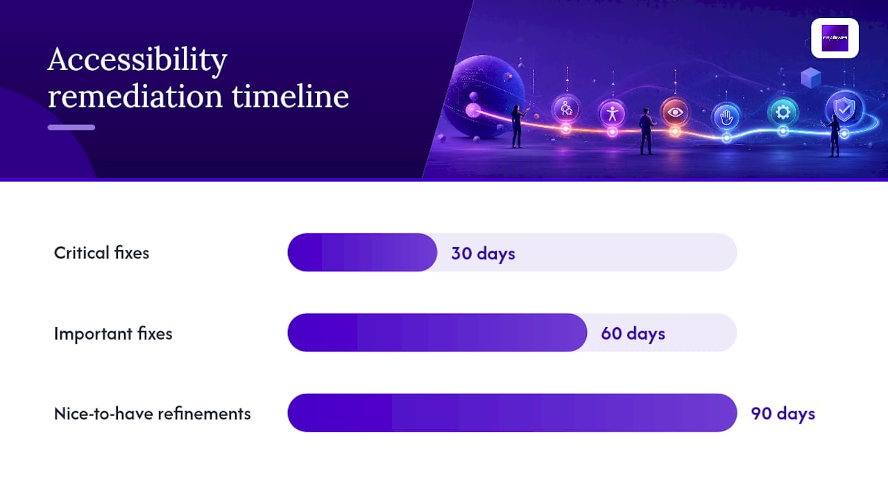
Realistic remediation runs in three phases, and trying to compress it into a single sprint usually produces shallow fixes that break again on the next content update.
- Critical fixes (weeks 1 to 4): contrast failures on primary conversion pages, missing alt text on key images, keyboard traps in navigation and checkout, and unlabeled form fields on your contact and quote request forms.
- Important fixes (weeks 5 to 8): heading hierarchy corrections across templates, ARIA cleanup, caption additions to existing video content, and focus-order fixes on complex components like carousels and accordions.
- Nice-to-have refinements (weeks 9 to 12): design system documentation, expanded user testing with assistive technology users, and a maintenance checklist so future content additions don’t reintroduce old problems.
| Timeline | Typical Owner | Example Tasks |
|---|---|---|
| 30 days | Developer or agency dev team | Automated scan remediation, top-page contrast and alt text fixes, statement published |
| 60 days | Developer plus content team | Heading structure fixes, form labeling across all templates, ARIA corrections |
| 90 days | Full team plus outside testers | Screen reader walkthrough, real user testing, documentation and maintenance plan |
Effort varies enormously depending on scope. A single landing page contrast fix might take a developer under an hour. A template-level fix, correcting the heading structure across every blog post on a CMS, touches one file but affects hundreds of pages at once, which is usually faster than it sounds. Design system work, rebuilding your button, form, and navigation components to be accessible by default, is the most expensive phase but pays off every time you launch a new page afterward.
Quick stat: Because manual and assistive-technology testing catches the majority of real-world issues that automated tools miss, budget real hours for keyboard and screen reader testing rather than treating it as an afterthought squeezed into the final week.
Whether you handle this internally or bring in outside help, use a staging environment for every fix before it goes live, and build a QA gate into your release process so a future template update doesn’t silently undo a fix you already paid for. City Web Company maintains an ADA compliant website checklist clients use to track exactly this kind of regression risk across releases.

How Do You Write an Accessibility Statement?
An accessibility statement does two jobs: it documents your conformance target honestly, and it gives visitors a way to report problems. Skip the marketing language and stick to specifics.
Required elements:
- Scope: which domain, subdomains, or sections the statement covers.
- Conformance target: name the exact standard and level, for example “WCAG 2.2 Level AA.”
- Known limitations: if certain third-party embeds or legacy PDFs aren’t yet compliant, say so rather than claiming blanket conformance you can’t back up.
- Contact method: a working email or form specifically for accessibility issues, with a realistic response time.
- Maintenance date: when the statement was last reviewed, and a commitment to review it on a set cadence.
Never write “fully accessible” or “100% ADA compliant.” No website reaches permanent, absolute conformance, since content changes constantly and new issues appear with every update. Write “conforms to WCAG 2.2 Level AA as of August 18, 2026, reviewed quarterly” instead. It’s defensible and it’s true.
A short annotated example: “[Business Name] is committed to ensuring digital accessibility for people with disabilities. We are actively working to conform to WCAG 2.2 Level AA. This statement was last reviewed in January 2026. If you encounter an accessibility barrier, contact us at [email] and we will respond within five business days.” Notice the honest hedging (“actively working to conform”) rather than an absolute claim, paired with a real contact commitment.
What Resources Should You Bookmark for Website Accessibility?
Keep these on hand for both policy decisions and hands-on technical work.
Standards and legal guidance:
- WCAG 2.2 for the full technical success criteria.
- Ada for private-sector legal context.
- Access Board Section 508 ICT guidance for federal and federally funded requirements.
Testing tools:
- axe and WAVE for fast automated scans you can run on any page in seconds.
- Lighthouse, built into Chrome DevTools, for a quick accessibility score alongside performance metrics.
- NVDA, JAWS, and VoiceOver for real screen reader testing across Windows, enterprise, and Apple environments.
- WebAIM’s Contrast Checker for verifying exact contrast ratios before a color goes into production.
For a structured, developer-oriented learning path covering all of the above in more depth, web.dev’s Learn Accessibility course is a genuinely useful evergreen reference worth working through once, then returning to as needed.
How Does City Web Company Approach Accessibility Projects?
Accessibility work at City Web Company follows a consistent process because inconsistent process is how businesses end up with a beautiful site that quietly fails half its visitors.
- Audit: automated scanning across every template, paired with a manual keyboard and screen reader pass on priority pages.
- Prioritized remediation: issues sorted by severity and page traffic, so a broken checkout form gets fixed before a low-traffic archive page.
- Design system updates: fixes rolled into reusable templates and components so future pages inherit the correction instead of repeating the mistake.
- Testing and sign-off: retest with the same methodology used in the audit, confirming the fix actually resolved the issue rather than just changing the code.
- Maintenance: a documented plan so new content additions get checked before they go live.
Typical deliverables include a written audit report, a prioritized issue list ranked by severity, code patches or template updates, and a ready-to-publish accessibility statement.
The businesses that come to us after a demand letter almost always had the same problem: nobody owned accessibility past launch day. The fix is process, not panic.
If you’re evaluating outside help, expect a discovery call, a scoped audit timeline (typically two to four weeks depending on site size), and clear checkpoints before any code changes ship. Legal and professional-services clients in particular carry higher exposure here; City Web Company’s guidance for website accessibility for law firms walks through why that sector faces more frequent scrutiny and what a realistic remediation scope looks like.
Why Treat Accessibility as Foundational, Not Optional Polish
Most businesses treat accessibility like insurance: something you buy after a scare, not before. That instinct is backwards, and it’s expensive.
The real cost isn’t the initial fix. It’s the compounding cost of retrofitting a design system, a CMS template, and years of published content all at once, under pressure, usually after a demand letter arrives. Compare that to building contrast ratios, semantic markup, and keyboard navigation into your design system from day one, where the marginal cost of doing it right is close to zero because you’re only building it once.
The W3C’s own accessibility guidelines make a version of this argument directly: accessibility works best when it’s part of the design phase, not a QA step bolted on after development. I’d go further. Treat it the way you treat site speed or mobile responsiveness, a baseline quality bar that every new page has to clear before launch, not a special project that gets scheduled and then perpetually deprioritized.
If you take one thing from this guide, make it this: assign an owner, build the checks into your release process, and revisit the statement quarterly. Accessibility that lives only in a one-time audit decays the moment your next content update ships.
Get Help Making Your Website Accessible and Compliant
Fixing accessibility issues yourself with a free scanner and a weekend is possible for a five-page brochure site. It gets a lot harder once you’re running a multi-location service business with booking forms, service area pages, and a content team publishing weekly. City Web Company runs the audit, prioritizes the fix list by real business impact, and rolls corrections into your design system so they stick past the first update cycle.

A first call typically covers your site’s scope, your current risk exposure, and a realistic timeline, usually two to four weeks for a small business site, longer for larger multi-template platforms. You walk away with a prioritized issue list and a straight answer on cost before anything gets scoped as a project. This sits alongside the rest of City Web Company’s full digital marketing and web design services, so accessibility fixes can roll into a broader site refresh instead of running as an isolated, disconnected project. If your homepage is already failing a basic contrast check, that’s the place to start the conversation.
Sources
Bookmark these for the two situations you’ll hit repeatedly: writing policy and troubleshooting a specific technical failure.
Use the standards pages when you’re setting policy or writing your accessibility statement. Use WebAIM and web.dev when you’re stuck on a specific technical implementation question.
This article is general information, not a substitute for advice from a qualified lawyer. Consult a qualified legal professional about your own circumstances before acting on anything here.
FAQ
What are the four principles of web accessibility?
The four principles are Perceivable, Operable, Understandable, and Robust, known together as POUR, and they organize every success criterion in the WCAG standard.
What are the ADA requirements for a website?
ADA.gov doesn’t name a single mandatory technical standard for private businesses, but its guidance points toward the same outcomes WCAG describes: screen reader compatibility, full keyboard access, and captioned media, with WCAG 2.1 or 2.2 Level AA widely treated as the practical benchmark.
Is WCAG 2.2 rated AAA or AA?
WCAG 2.2 isn’t a single rating. It offers three conformance levels, A, AA, and AAA, and most organizations, including City Web Company’s client work, target Level AA as the realistic, defensible standard.
How can I make sure my website is accessible?
Run an automated scan with axe or WAVE, fix the highest-impact issues like contrast and missing alt text, then follow up with manual keyboard navigation testing and a screen reader pass using NVDA, JAWS, or VoiceOver before publishing an accessibility statement.
Recommended
These articles were popular with other readers too: