

An agency playbook for med spa website design: consultation-first booking, HIPAA capable intake, a fast audit checklist, RFP must-haves, and realistic...
Book Jobs in 4–8 Weeks with Moving Company Website Design
The best moving company website design is conversion-first and mobile-first: a short instant-quote form above the fold, visible trust signals (reviews, licensing, insurance), and clear service-area details that turn browsers into booked jobs. Everything else, including polished branding and blog content, matters, but only after those three elements are locked in.
TL;DR:
- The most effective moving company websites feature a simple, short contact form above the fold, clear trust signals, and visible service-area details to convert visitors rapidly.
- Key design elements include a concise hero with licensing badges, authentic crew and truck photos, localized city pages, and a short testimonial video near the quote form.
- Structuring the site with a prioritized homepage flow and dedicated local pages helps boost local search rankings and improves conversion rates.
- Technical standards such as fast mobile load times, large tap targets, HTTPS, and schema markup are crucial for performance and search engine ranking.
- Upfront fixes should focus on optimizing quote forms, lead routing, and visible trust signals, while photography and SEO are secondary investments.
Table of Contents
Table of Contents
- What Are the Must-Have Features of a High-Converting Mover Website?
- What Do the Best Moving Company Websites Actually Look Like?
- How Should You Structure a Moving Company Website?
- How Do You Turn Website Visitors Into Booked Jobs?
- What Technical Standards Should a Moving Website Meet?
- Why Does Original Photography Matter More Than Stock Images?
- How City Web Company Builds Moving Websites That Convert
- Author Perspective: Where To Spend Your First Redesign Dollar
- Get Started With City Web Company
- Sources
- FAQ
What Are the Must-Have Features of a High-Converting Mover Website?
A homepage that books jobs answers three questions in under five seconds: what you do, where you work, and what to do next. Bury that answer under a slideshow or a wall of navigation links, and visitors bounce to the next search result.
Every high-converting mover site includes:
- A hero section stating the service, service area, and a single clear call-to-action
- A short quote form, ideally three fields (name, phone, ZIP or move date), not a ten-field intake form
- Click-to-call buttons that work as actual
tel:links on mobile, not just styled text - A sticky header or footer CTA that follows the visitor as they scroll
- Review stars, a Google rating, and licensing badges (USDOT number, state mover license) visible in or near the hero
- Simplified navigation that funnels toward the quote form rather than a maze of service submenus
Industry roundups of high-performing mover sites consistently point to the same pattern: short forms above the fold, with detailed inventory questions saved for after the first contact. That sequencing matters more than most redesigns account for. Asking for a full household inventory before a visitor has even decided to trust you is the single fastest way to lose the lead.
Pro Tip: Put your USDOT number in the footer AND near your quote form. Buried compliance information doesn’t build trust, visible compliance information does.
What Do the Best Moving Company Websites Actually Look Like?
You don’t need to invent a design from scratch. The patterns that convert are well documented, and they repeat across the strongest sites in the industry.
- The verified hero. A short headline (seven words or fewer), an instant CTA button, and a licensing badge or insurance statement sitting inline with the headline, not tucked into a footer.
- The real-crew photo wall. Actual employees in branded uniforms next to actual trucks, not a stock photo of a generic moving box. Original photography reads as legitimate in a way stock images never do.
- The short-form testimonial clip. A 30 to 60 second video of a real customer talking about their move, embedded near the quote form, not buried on a separate testimonials page.
- The friction-reducing microcopy. Instead of “Submit,” buttons that say “Get My Free Quote” or “See My Moving Cost.” Small wording changes next to a form field measurably change completion rates.
- The service map. Multi-location movers benefit from an interactive service-area map rather than a text list, a pattern several publishers highlight as a differentiator for companies operating multiple branches.
Static photography works for most pages. Save video for the hero and testimonials section only, where the extra load time is worth the trust it buys.
How Should You Structure a Moving Company Website?
Site architecture for movers is simpler than most owners assume, but the order of content blocks on each page determines whether visitors convert or leave.
The homepage should run in this order: hero with CTA, trust bar (reviews and badges), core services summary, service-area callout, a short “why us” block, and a final CTA. Every service page (local moving, long-distance, packing, storage) needs its own headline, a plain-language description of scope, a pricing cue (even a range or “free quote” framing), a CTA, and two or three FAQs specific to that service.
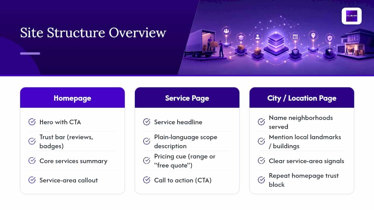
City and service-area pages deserve real attention. They rank because they answer a specific local query, and checklists for mover sites consistently flag clear service-area signals as a ranking and conversion factor. Each city page should name the neighborhoods served, mention any local landmarks or building types your crews regularly handle, and repeat the trust block from the homepage. Location-specific landing pages built this way outperform a single generic “service areas” page by a wide margin.
Round out the architecture with supporting resources: a downloadable moving checklist as a lead magnet, and blog posts targeting queries like “cost to move a 2 bedroom apartment in [city].” A printable moving-day checklist or standard paperwork, similar to what Atlas Allied provides, also works well as an onboarding asset after a lead converts.
How Do You Turn Website Visitors Into Booked Jobs?
Design gets someone to your quote form. What happens in the next sixty seconds decides whether that visitor becomes a customer.
- Keep the first form short. Name, phone number, ZIP code, and move date. Save inventory details, additional stops, and specialty items (pianos, safes) for a second step after initial contact.
- Route leads instantly. A quote submission should trigger an SMS or app alert to a dispatcher within seconds, and sync automatically into whatever CRM your team already uses. A lead that sits in an inbox for six hours is a lead calling three competitors instead.
- Track calls, not just form fills. Call tracking numbers tell you which pages, ads, or city pages are actually generating phone calls, which is where most mover leads still come from.
- Build a simple KPI dashboard. Cost per lead, form completion rate, and call answer rate matter more than vanity metrics like total site visits.
- Automate the follow-up. A confirmation text immediately after form submission, followed by a reminder 24 hours later if no booking has happened, recovers leads that would otherwise go cold.
Pro Tip: If your quote form doesn’t fire a same-minute text alert to whoever answers phones, you’re losing jobs to the mover who calls back first. Speed to first contact is the single most underrated conversion lever in this business.
What Technical Standards Should a Moving Website Meet?
Design choices that look great on a designer’s monitor often fail on the phone screen where most of your traffic actually lands. Technical execution is what makes the design work in the real world.
- Compress hero images and lazy-load everything below the fold. A homepage that takes four seconds to load on mobile is losing visitors before they see your trust badges.
- Use critical CSS and browser caching so the above-the-fold content renders fast even on a mediocre connection.
- Keep tap targets large enough for a thumb, simplify mobile navigation to a handful of items, and keep the call and quote buttons sticky on scroll.
- Set unique title tags and H1 headings for every service and city page, add LocalBusiness schema markup, and keep your site’s address and phone number identical to your Google Business Profile listing.
- Run HTTPS everywhere, keep automated backups, and confirm the site meets basic ADA accessibility standards, alt text, keyboard navigation, and sufficient color contrast.
Google’s own mobile usability guidance and most Core Web Vitals audits treat load speed and tap-target sizing as ranking and conversion factors simultaneously. A website design audit focused on local service businesses usually turns up two or three quick technical fixes that move the needle faster than any new page you could add.
Why Does Original Photography Matter More Than Stock Images?
Stock photography is the fastest way to make a moving company website feel interchangeable with every competitor running the same theme. Real crew and truck photos, by contrast, signal you actually exist and actually do the work you’re advertising.
- Photograph your crew in uniform next to your actual trucks, not a generic warehouse background.
- Match truck wraps, uniforms, and website color schemes so the online experience matches what shows up on move day.
- Capture a 30 to 60 second testimonial on a phone camera; production value matters less than authenticity.
- Brief any photographer with three shots minimum: crew portrait, loaded truck, and a customer handoff moment.
Pro Tip: A $200 phone-shot photo session of your actual crew will outperform a $2,000 stock photo license every time. Buyers can tell the difference instantly, even if they can’t articulate why.
How City Web Company Builds Moving Websites That Convert
A typical mover website build runs through discovery, wireframing, design, development, and launch, usually four to eight weeks depending on how many service-area pages the site needs. City Web Company’s moving company marketing services wire in the pieces covered above: instant quote forms connected to lead routing, city and service-area pages built for local search, a live review feed pulled from Google, and call and form tracking from day one.
Deliverables focus on what actually drives bookings, not just what looks polished in a portfolio.
- Instant-quote form wired to SMS and CRM lead routing
- City and service-area page templates built for local ranking
- Google review feed integrated near the hero and trust blocks
- Call tracking and a KPI dashboard covering cost per lead and answer rate
A moving company website only earns its cost when it’s measured the same way a sales rep would be: leads generated, calls answered, jobs booked. Anything short of that standard is decoration, not design.
Author Perspective: Where To Spend Your First Redesign Dollar
If your budget is tight, fix forms and lead routing first, then trust signals like reviews and licensing, then photography and SEO last. DIY works for a basic form and review widget. Hire a specialist for routing, schema, and city pages. This week: audit your form fields, add a sticky call button, and publish your USDOT number.
— Matt
Get Started With City Web Company
City Web Company is the direct alternative to hiring a freelancer or duct-taping together a template site: instead of guessing at forms and hoping for traffic, you get a moving website built specifically to route leads to your phone within seconds and rank for the cities you actually serve. That combination, conversion-first design plus local SEO plus paid media if you need volume fast, is what a template purchase or a generalist freelancer typically can’t deliver in one package.


The web design and development team at City Web Company starts every mover project with the same priorities covered in this article: a working instant-quote form, visible trust signals, and city pages that actually rank, before anything else gets touched. Reach out through the get-started page for a free consultation, and expect a scoped timeline and a list of quick technical wins within the first conversation.
Sources
This article draws on guidance from the FTC, the Better Business Bureau, and industry checklists from SmartMoving and MoveHQ.
- 10 Moving Company Website Designs That Actually Book Jobs
- Moving Company Website Design in 2025: The Checklist to Turn Visitors into Booked Jobs
- Top Moving Company Website Designs — MoveHQ
FAQ
What Are Red Flags For Moving Companies?
Red flags include no USDOT or state mover license listed anywhere on the site, no written estimate offered before booking, and no verifiable reviews outside the company’s own testimonials page, all points the BBB flags for consumers hiring movers.
What Are the 7 C’s of Website Design?
Definitions vary across sources, but the version most commonly cited covers clarity, consistency, credibility, conversion, content, compatibility (mobile and cross-browser), and communication, all principles that apply directly to a mover’s quote form and trust signals.
What Software Do Moving Companies Use?
Most moving companies pair a CRM or dispatch platform for lead and job management with call tracking software and a scheduling tool, all of which should sync directly with the website’s quote form for instant lead routing.
What Is the Best Website Design for a Moving Company?
The best design is mobile-first, leads with a short instant-quote form and visible licensing and review signals, and uses real crew and truck photography instead of stock images, an approach City Web Company builds directly into its moving company sites.
Recommended
These articles were popular with other readers too: