

In the AI era, multi location local SEO depends on each branch earning trust through accurate profiles, crawlable pages, and third party signals.
How to Design Professional Websites That Win Customers
Professional web design is the practice of combining visual clarity, performance, and accessibility to create websites that convert visitors into customers. If you own a local service business, your website is your most visible salesperson, and users decide within 3 seconds whether it earns their attention or loses it. This guide covers how to design professional websites from the ground up, including site architecture, visual hierarchy, mobile-first design, speed optimization, and accessibility. Follow these steps and you will have a site that ranks better, loads faster, and turns more visitors into leads.
Table of Contents
How to design professional websites: start with structure and goals
The biggest mistake small business owners make is opening a website builder before defining what the site needs to accomplish. Structure and goals come first. Every design decision flows from them.
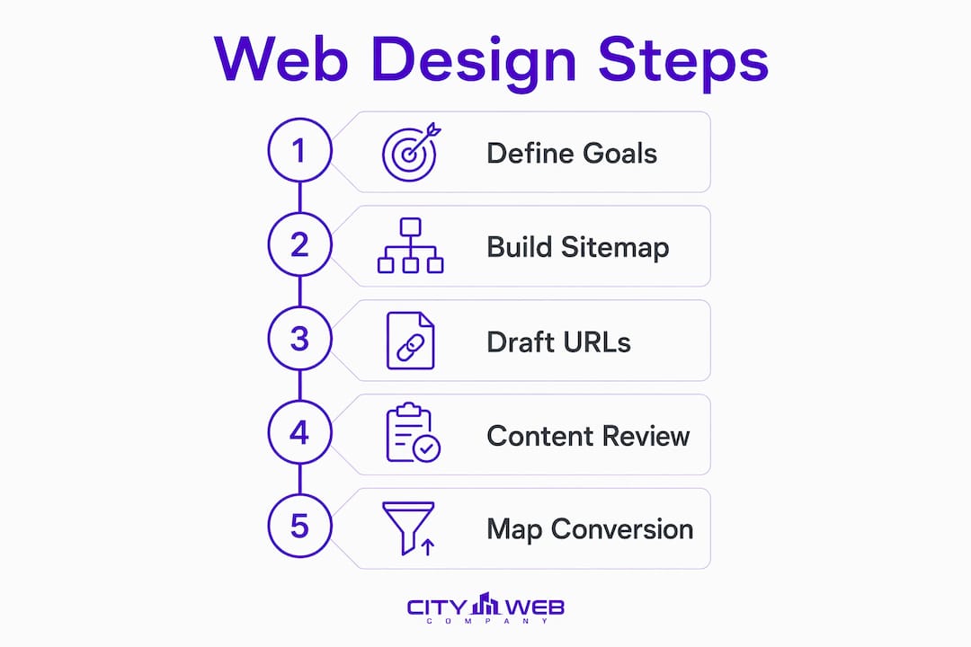
Step 1: Define one primary goal per page. Your homepage might exist to capture phone calls. Your services page exists to explain what you offer and push visitors toward a quote form. Your about page builds trust. When each page has one job, design becomes straightforward and conversion paths stay clear.

Step 2: Build a sitemap before you touch a template. Limiting your top navigation to five items reduces cognitive overload and keeps users focused on the actions that matter. More than five menu items forces visitors to make too many decisions at once, which increases bounce rates.
Step 3: Draft your URL structure for SEO and usability. Clean URLs like "/services/hvac-repairoutperform/page?id=47` in both search rankings and user trust. Keep URLs short, descriptive, and free of unnecessary parameters.
Step 4: Conduct a content inventory and competitor review. List every page you need, every piece of content you have, and every gap between them. Review three to five competitors in your market to identify what they cover and where you can go deeper or clearer.
Step 5: Map your conversion paths. Identify the exact sequence of pages a visitor travels from landing to contacting you. Every page in that sequence needs a visible next step.
Here is a simple framework for planning your site architecture before design begins:
| Planning task | Why it matters |
|---|---|
| Define one goal per page | Prevents competing CTAs and keeps user focus sharp |
| Limit navigation to 5 items | Reduces decision fatigue and improves usability |
| Draft clean URL structures | Supports SEO and builds user trust |
| Audit existing content | Identifies gaps before design locks in structure |
| Map conversion paths | Reveals where visitors drop off and where CTAs belong |
What are the core principles of effective web design?
Visual hierarchy, simplicity, and consistency are the three principles that separate professional websites from amateur ones. Get these right and the rest of design falls into place.

Visual hierarchy guides every eye movement
Visual hierarchy uses size, color, contrast, and position to direct attention from the most important element to the next most important, ending at a call to action. Your headline should be the largest text on the page. Your subheadings should be noticeably smaller. Your CTA button should use a color that appears nowhere else on the page. Bounce rates exceed 70% on sites with poorly defined visual paths, and CTAs with proper visual prominence convert at double the rate of low-contrast buttons. That gap is entirely fixable through intentional hierarchy.
Simplicity removes friction
Every element on a page either helps the visitor take action or gets in the way. Remove anything that does not serve the page’s primary goal. That means cutting stock photo carousels that slow load times, eliminating paragraph blocks that bury the main message, and reducing the number of font styles to two: one for headings, one for body text. Whitespace is a functional design tool, not empty space. It separates content into digestible chunks and draws the eye toward what matters.
Consistency builds trust
Visitors trust websites that feel predictable. Use the same color palette, the same button style, and the same navigation structure across every page. When a user clicks to your services page and the layout looks completely different from the homepage, confidence drops. Design systems built with tokens and patterns before page layouts are created reduce inconsistencies and speed up development. For small businesses working with a designer or agency, requesting a style guide as a deliverable protects consistency long after launch.
- Use two font families maximum: one serif or sans-serif for headings, one for body text
- Stick to a palette of three to five colors, with one reserved exclusively for CTAs
- Keep button shapes, sizes, and label conventions identical across all pages
- Maintain consistent padding and spacing between sections to create visual rhythm
- Never change the navigation structure between pages without a deliberate reason
Pro Tip: Build your brand colors, fonts, and spacing rules into a one-page style reference before you design a single page. Designers call this a design token sheet, and it prevents the “every page looks slightly different” problem that plagues most small business websites.
How does mobile-first design affect your website’s reach?
Over 60% of web traffic is mobile, which means designing for desktop first and adapting for mobile second is designing for the minority of your visitors. Mobile-first design flips that process. You design the small-screen experience first, then scale up to tablet and desktop.
The practical difference is significant. A mobile-first approach forces you to prioritize content ruthlessly. If something does not fit on a 390-pixel screen without scrolling past the fold, it probably does not belong above the fold on desktop either. Touch-friendly controls require tap targets of at least 44 by 44 pixels, which also improves usability for desktop users with limited dexterity.
Accessibility belongs in the same conversation. WCAG 2.2 AA standards are the baseline expectation for professional websites in 2026, covering more than 180 rules across four principles: perceivable, operable, understandable, and robust. The most commonly violated rules are contrast ratios below 4.5:1, missing alt text on images, and navigation that breaks without a mouse.
- Maintain a color contrast ratio of at least 4.5:1 between text and background
- Add descriptive alt text to every image, including decorative ones marked as empty strings
- Test keyboard navigation by tabbing through your entire site without a mouse
- Use ARIA labels on interactive elements like forms, modals, and dropdown menus
- Run your site through Google Lighthouse and WebAIM WAVE to catch accessibility gaps
Retrofitting accessibility late in development costs roughly three times more than building it in from the start. For a small business on a fixed budget, that cost difference is the difference between a profitable site and an expensive rebuild.
Pro Tip: Test your site on a real Android device, not just browser developer tools. Emulators miss real-world rendering issues, especially with fonts and touch targets, that only appear on physical hardware.
Does website speed actually affect your Google rankings?
Website speed directly determines your Google rankings and your conversion rate. A slow website reduces conversions by 7% for every additional second of load time. That is not a rounding error. For a service business generating 50 leads per month, a two-second delay costs roughly seven leads before a single visitor reads your headline.
Google measures speed through Core Web Vitals, and the most important metric is Largest Contentful Paint (LCP). Google ranks sites with LCP above 2.5 seconds worse in search results, which means slow sites lose organic traffic before users ever see the design. The page load benchmarks that matter most for service businesses target LCP under 2.5 seconds and total page weight under 1.5 MB.
Here is how the most common performance techniques compare in impact and effort:
| Technique | Speed impact | Implementation effort |
|---|---|---|
| Compress and convert images to WebP | High | Low |
| Enable lazy loading for below-fold images | High | Low |
| Minify CSS, JavaScript, and HTML | Medium | Low |
| Use a content delivery network (CDN) | High | Medium |
| Remove unused third-party scripts | Medium | Medium |
| Enable browser caching | Medium | Low |
Content strategy works alongside speed to keep visitors engaged once the page loads. Use H2 and H3 headings to break content into scannable sections. Keep paragraphs to three to five sentences. Use bullet lists for steps and features. Place your most important information in the first two paragraphs of every page, because most visitors never scroll past the midpoint.
CTAs deserve their own attention. One primary CTA per section with strong contrast outperforms weak or multiple competing CTAs. Use action verbs: “Get a Free Quote,” “Call Now,” or “Schedule Your Inspection” outperform “Submit” or “Click Here” every time. The importance of a strong CTA extends beyond button copy to placement, color, and surrounding whitespace.
Pro Tip: Run Google PageSpeed Insights on your three most important pages before and after any design change. Screenshot the scores. This gives you a before-and-after record that proves the work paid off and catches regressions before they cost you rankings.
Common mistakes that undermine professional website design
Most small business websites fail not because of bad taste but because of predictable, fixable mistakes. Knowing what they are lets you avoid them before they cost you traffic and leads.
- Overcrowded pages with competing CTAs. When every section has a different button asking for a different action, visitors freeze and leave. Pick one primary action per page and make every other element support it.
- Neglecting mobile until the end. Designing desktop first and then compressing it for mobile produces broken layouts, tiny text, and tap targets that miss. Mobile-first design prevents this entirely.
- Too many font weights and colors. Using four font weights, three typefaces, and six brand colors across a single page destroys visual consistency. Two fonts and three to five colors is the professional standard.
- Ignoring performance metrics post-launch. Sites slow down over time as plugins update, images accumulate, and third-party scripts multiply. A site that scored 90 on PageSpeed Insights at launch may score 60 six months later without maintenance.
- Weak or missing accessibility. Missing alt text, poor contrast, and broken keyboard navigation exclude users and create legal exposure. Accessibility is not optional for a business that wants to serve everyone in its market.
- No clear visual hierarchy on the homepage. If a visitor cannot identify your headline, your primary service, and your CTA within five seconds, the page is not doing its job. Test this by showing your homepage to someone unfamiliar with your business and asking them what you do and what they should do next.
Key takeaways
Professional website design requires visual hierarchy, mobile-first structure, sub-2.5-second load times, and WCAG 2.2 AA accessibility built in from day one, not added later.
| Point | Details |
|---|---|
| Plan before you design | Define one goal per page and limit navigation to five items before opening any builder. |
| Visual hierarchy drives conversions | Size, color, and position guide visitors from headline to CTA, cutting bounce rates significantly. |
| Mobile-first is non-negotiable | Over 60% of traffic is mobile; design for small screens first and scale up. |
| Speed is a ranking factor | LCP above 2.5 seconds hurts Google rankings and costs 7% in conversions per extra second. |
| Accessibility saves money | Building WCAG 2.2 AA compliance upfront costs three times less than retrofitting it later. |
What I have learned from watching small businesses get web design wrong
The most consistent pattern I see with small business websites is not bad design. It is misplaced priorities. Owners spend weeks picking fonts and color palettes while their homepage takes six seconds to load on a mobile connection. The visual polish is invisible to Google and irrelevant to a visitor who bounced before the hero image finished loading.
The second pattern is treating accessibility as a legal checkbox rather than a design principle. When you build with keyboard navigation, proper contrast, and descriptive alt text from the start, you are not just protecting yourself from liability. You are building a site that works for every visitor, including the 26% of American adults who live with some form of disability. That is not a niche audience.
What actually moves the needle for local service businesses is a combination of three things: a homepage that communicates the primary service and location within the first viewport, a CTA that is visible without scrolling, and a load time under three seconds on mobile. Everything else, including the font choice, the color scheme, and the photography, is secondary to those three. I have seen beautifully designed sites that generate zero leads and plain sites with strong hierarchy and fast load times that generate dozens per month.
The advice I give consistently is this: fix your visual hierarchy and your site speed before you redesign anything. Those two changes alone will outperform a full visual overhaul in most cases. Then build your design system before you build your pages, because design systems reduce development time by roughly 40% and prevent the inconsistency that makes sites look unprofessional regardless of how good the individual elements are.
Launch is not the finish line. Test, measure, and iterate. Check your Core Web Vitals monthly. Run a heatmap tool like Hotjar or Microsoft Clarity to see where visitors actually click. Update your CTAs based on what the data shows. The sites that consistently generate leads are the ones that treat design as an ongoing practice, not a one-time project.
— Matt
Ready to build a website that actually generates leads?
City Web Company designs and develops professional websites built specifically for local service businesses. Every site is built with performance, accessibility, and conversion in mind from the first wireframe to the final launch.
If your current site is slow, hard to navigate on mobile, or failing to turn visitors into calls and form submissions, City Web Company can fix that. The team handles everything from site architecture and visual design to local SEO integration, so your website works as a lead generation tool, not just a digital business card. Explore City Web Company’s web design and development services to see how a professionally built site can increase your visibility and grow your revenue. Pair that with local SEO services and your site will rank where your customers are already searching.
FAQ
What makes a website look professional?
A professional website has clear visual hierarchy, consistent fonts and colors, fast load times under 2.5 seconds, and a single visible CTA per page. Consistency across all pages and mobile-optimized layouts are the two most visible markers of professional design.
How many pages does a small business website need?
Most local service businesses need five to seven core pages: homepage, services, about, contact, and one to three service-specific or location-specific pages. Each page should have one defined goal and one primary CTA.
How do I make my website mobile-friendly?
Design for mobile screens first using a responsive framework, keep tap targets at least 44 by 44 pixels, compress images to WebP format, and test on real devices rather than browser emulators. Mobile-first design ensures parity between desktop and mobile experiences.
What is the most important performance metric for websites?
Largest Contentful Paint (LCP) is the most critical metric. Google targets LCP under 2.5 seconds as the threshold for good performance, and sites that exceed 4 seconds face significant ranking penalties and conversion losses.
How much does accessibility matter for a small business website?
Accessibility directly affects your reach and your legal standing. Following WCAG 2.2 AA standards covers keyboard navigation, screen reader support, and contrast ratios, and building these in from the start costs three times less than fixing them after launch.
Recommended
These articles were popular with other readers too: