This guide will empower you to establish a strong online presence from the ground up…
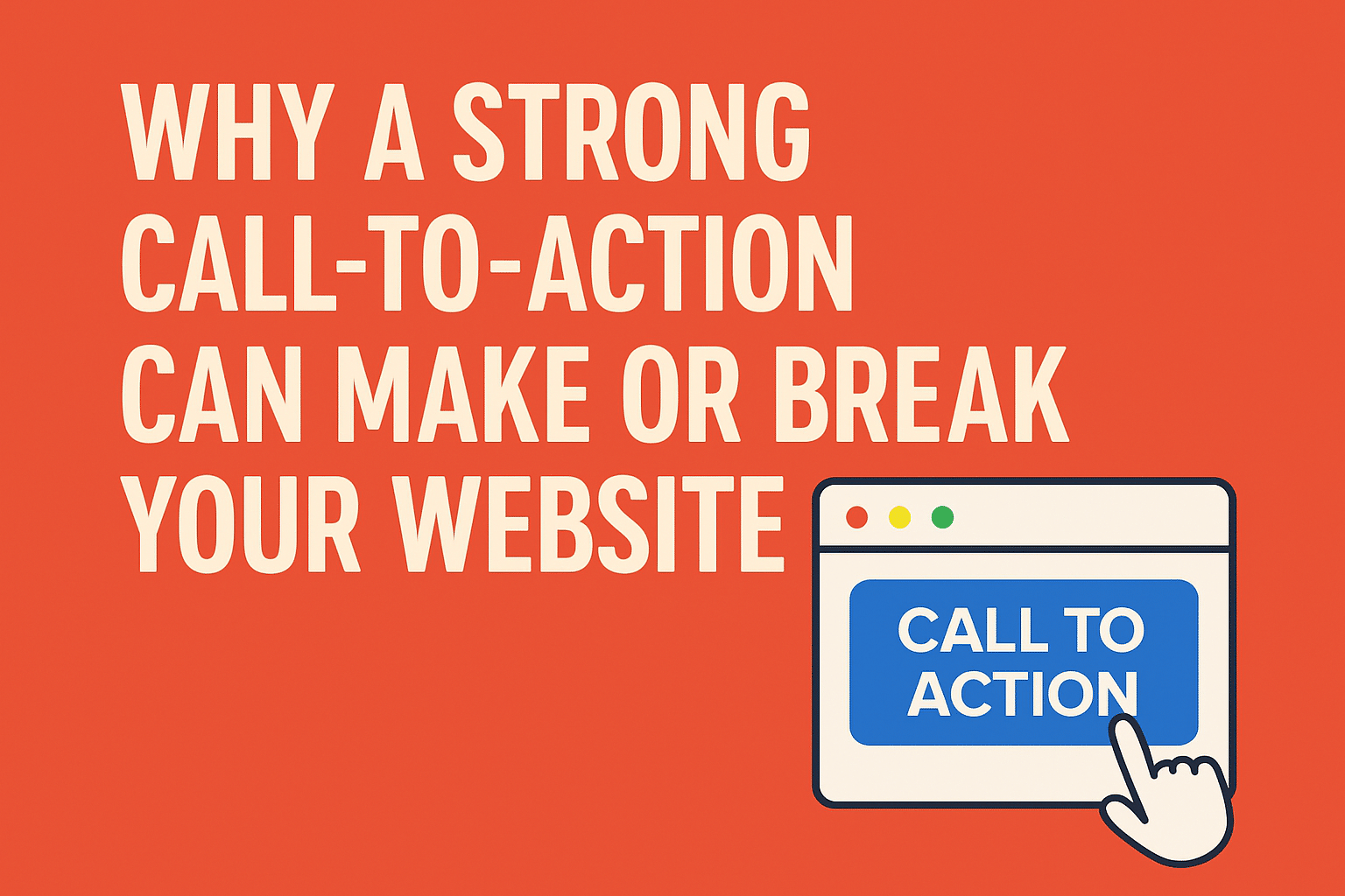
Why a Strong Call-to-Action Can Make or Break Your Website
Discover how a powerful call-to-action (CTA) can transform your website from a passive page into a dynamic lead-generating machine. Without a compelling CTA, you risk losing potential customers who may not know their next step, leading to missed opportunities and reduced conversions. A well-crafted CTA not only guides your visitors but also enhances their experience, fostering trust and encouraging engagement. Take control of your website’s performance by implementing strategies that create an irresistible pull for your audience.
Table of Contents
Key Takeaways:
- A compelling call-to-action (CTA) guides visitors on the next steps, enhancing the user experience.
- Effective CTAs increase conversion rates by encouraging users to take specific actions, such as signing up or making a purchase.
- The placement, design, and wording of a CTA can significantly impact its effectiveness and overall website performance.
- Testing different variations of CTAs can provide insights into what resonates best with your audience.
- A strong CTA aligns with your website’s goals and messaging, ensuring a cohesive user journey.
The Psychology of Persuasion in Web Design
Understanding the psychological factors that influence user behavior is vital for crafting effective call-to-actions (CTAs). By tapping into the workings of the human mind, you can create CTAs that not only attract attention but also prompt your visitors to take action. Why a Call-to-Action Will Always Matter lies in its ability to connect with your audience on a deeper level, enhancing the chances of conversion.
Understanding User Motivation
People often act based on a set of motivations driving their online behavior. These motivations can range from the desire for information, seeking solutions to problems, or simply wanting to feel a sense of belonging. By identifying these underlying triggers and addressing them through targeted CTAs, you can significantly improve user engagement and ensure that visitors feel compelled to take the next step.
The Role of Emotional Triggers
Emotional triggers impact decision-making processes, leading individuals to act based on feelings rather than logic. For instance, using urgency in your CTAs, such as “Limited time offer,” can evoke a sense of fear of missing out (FOMO), thereby pushing users towards quicker decisions. Conversely, employing positive emotions, like joy or relief, in your messaging can create an inviting atmosphere, encouraging visitors to engage with your content.
The effectiveness of emotional triggers cannot be overstated. Research has shown that websites that evoke strong emotions can increase conversion rates by up to 30%. Consider utilizing emotional language and imagery in your CTAs to resonate with visitors. Elements such as testimonials or community-driven messages can enhance connection, leading to higher engagement rates. By carefully crafting your CTAs with emotional resonance, you create a stronger bond with users, ultimately driving more conversions.
Elements of an Irresistible Call-to-Action
Incorporating effective elements into your call-to-action can greatly enhance its effectiveness. Developing a CTA that resonates with your audience means understanding the art of persuasion. For more insights, check out What is a Call to Action and Why Do You Need One ….
Crafting Compelling Copy
Your CTA’s copy must be engaging and actionable. Use strong verbs that inspire immediate action, like “Get,” “Join,” or “Start.” Clear, concise language ensures that visitors understand exactly what you want them to do. Aim for simplicity; for instance, “Subscribe Now” communicates urgency without confusion.
Designing for Visibility and Engagement
Engaging CTAs require attention-grabbing design elements. Utilize contrasting colors and strategic sizing to make your CTA stand out on the page. Icons or arrows can visually guide users toward the action you want them to take. Make it large enough to be noticed but not so overpowering that it detracts from the overall design.
For example, a brightly colored button on a muted background draws the eye more effectively than a button that blends in. Experiment with hover effects or animations to add an element of interactivity, encouraging users to engage further. Remember that your goal is to inspire action without overwhelming visitors.
The Importance of Placement and UX
Positioning your CTA correctly within the user experience can significantly impact its performance. Placing CTAs above the fold ensures they are seen immediately, while contextual placements within content can increase relevance and likelihood of click-throughs. Think about how users navigate your site; a well-placed CTA feels natural and unobtrusive.
Consider the customer journey when deciding where to place your CTAs. For instance, at the end of a blog post is prime real estate for a CTA, as readers have engaged with your content and may be more inclined to take the next step. Aim for a seamless user experience that feels intuitive and enhances the likelihood of conversions.
Measuring Success: Metrics That Matter
Understanding the effectiveness of your call-to-action (CTA) is important for refining your website’s performance. Focusing on key metrics like conversion rates, user engagement, and click-through rates will provide you with insights into how well your CTAs resonate with visitors. Analyzing these metrics not only showcases how your CTAs contribute to your overall goals but also helps you identify areas for improvement.
Conversion Rates and Their Interpretation
Conversion rates provide a clear picture of how many of your visitors are taking the desired action after interacting with your CTA. Calculating this rate involves dividing the number of conversions by the total number of visitors and multiplying by 100. A high conversion rate suggests that your CTAs are effective, while a low rate signals a need for re-evaluation. Understanding the context of these numbers, including the traffic sources and user demographics, can also reveal deeper insights.
A/B Testing to Optimize CTAs
Engaging in A/B testing can significantly enhance your CTA’s performance. By running experiments where you compare two variations of a CTA, you can pinpoint which elements—such as color, wording, or placement—resonate best with your audience. This data-driven approach empowers you to make informed decisions for creating CTAs that convert more effectively.
A/B testing allows you to gather real-time data on visitor behavior and preferences. For instance, if you test two different button colors—red versus green—you might find that the red button yields a 25% higher conversion rate. These insights enable you to refine your CTAs continually, increasing their appeal and effectiveness. Furthermore, testing different messages, lengths, or even images can unveil which combinations drive the most engagement, helping you to align your CTAs with user expectations and improve overall website performance.
Common Mistakes to Avoid
As you refine your call-to-action strategy, avoiding common pitfalls can significantly enhance your website’s effectiveness. Many businesses stumble by not aligning their language to their audience’s expectations, while others underestimate the impact of seamless user experiences. Here are some common mistakes that can derail your efforts, costing you valuable conversions and engagement.
Overcomplicating Your Message
A convoluted message can confuse your visitors and diminish your call-to-action’s effectiveness. Simplicity is key; your CTAs should be clear and straightforward, leaving no room for misinterpretation. Avoid jargon and complicated language that detracts from your core offer. A concise, compelling phrase such as “Get Your Free Trial” is often far more effective than a lengthy, complicated explanation of benefits.
Neglecting Mobile Responsiveness
With over half of all web traffic coming from mobile devices, neglecting mobile responsiveness can severely impact your call-to-action’s effectiveness. If your CTAs aren’t easily accessible or visually appealing on smartphones and tablets, you risk losing a significant portion of potential conversions.
Ensuring that your CTAs are mobile-friendly is non-negotiable. This includes making buttons large enough for comfortable tapping, ensuring text is legible, and the layout adjusts seamlessly across different screen sizes. Additionally, consider optimizing loading speeds since slow-loading pages can deter users, especially on mobile. Statistics show that a one-second delay in page load can result in a 7% reduction in conversions. By prioritizing mobile responsiveness, you not only enhance user experience but increase the likelihood of driving actions that matter.
Future Trends: The Evolution of CTAs
The future of call-to-action (CTA) design is poised for transformation, driven by advancements in technology and shifts in user behavior. With a growing emphasis on creating tailored experiences, you can expect CTAs to become increasingly sophisticated. Innovations in personalization, artificial intelligence, and interactive elements will redefine how you engage your audience, ultimately leading to a more effective conversion experience.
Personalization and AI in Call-to-Action
Integrating AI-driven personalization into your CTAs can significantly boost user engagement. By analyzing user data, AI can help you create personalized CTAs that resonate with individual preferences and behaviors, which can lead to higher conversion rates and a better overall user experience.
Interactive Elements Enhancing Engagement
Incorporating interactive elements within your CTAs captivates users and encourages them to engage more meaningfully. Features like polls, quizzes, sliders, and animations can transform a static button into an engaging experience, making the call to action memorable and distinct. These elements not only elevate user engagement but also motivate visitors to explore your website further.
Consider implementing interactive CTAs like personalized quizzes that guide users towards specific products or services based on their answers. For instance, an online apparel store might use a quiz to recommend outfits tailored to individual style preferences. This not only enhances the user journey but creates a sense of collaboration, encouraging users to take the desired action. Incorporating gamified elements, such as progress tracking bars or reward systems, can further incentivize action, driving higher conversion rates while promoting brand loyalty. This innovative approach transforms routine CTAs into dynamic engagements, ultimately enriching the overall user experience on your website.
Conclusion
Presently, a strong call-to-action is vital for your website’s success, guiding visitors toward desired actions and increasing conversion rates. By effectively engaging your audience, you can enhance their experience and ultimately drive your business goals. It’s important to continually evaluate and refine your calls-to-action to maximize effectiveness. For further insights, consider exploring What Makes A Good Call To Action? to ensure your website remains compelling and actionable.
Q: What is a call-to-action (CTA) and why is it important for my website?
A: A call-to-action (CTA) is a prompt on a website that encourages users to take a specific action, such as signing up for a newsletter, making a purchase, or downloading a resource. A well-crafted CTA is important because it guides visitors towards the next steps you want them to take, effectively directing user behavior and improving overall conversion rates.
Q: How can a strong CTA impact website conversions?
A: A strong CTA can significantly impact website conversions by clearly defining the desired action, creating a sense of urgency, and appealing to the emotions of the audience. Properly designed CTAs can increase the likelihood that visitors will engage with your content or offerings, thereby boosting sales, sign-ups, or other key performance metrics.
Q: What are the key elements of an effective call-to-action?
A: An effective call-to-action should have specific elements, including clear and concise wording, a strong contrasting color that stands out from the surrounding content, and a sense of urgency or exclusivity (e.g., “Limited Time Offer”). Additionally, it should be strategically placed within your website to maximize visibility and encourage interaction.
Q: How can I test and optimize my CTAs for better performance?
A: Testing and optimizing CTAs can be done through methods such as A/B testing, where two versions of a CTA are compared to see which performs better. You can experiment with different colors, wording, sizes, and placements. Analyzing user behavior through metrics like click-through rates will also help identify what resonates most with your audience, allowing you to make data-driven improvements.
Q: Can the style of my website affect the effectiveness of CTAs?
A: Yes, the overall style and design of your website can greatly affect the effectiveness of your CTAs. A cluttered or confusing layout may distract visitors and reduce visibility of CTAs. On the other hand, a clean and cohesive design can enhance user experience, making CTAs more noticeable and inviting. Ensuring that your CTAs fit seamlessly within your site’s aesthetic while remaining prominent is key to driving user action.
These articles were popular with other readers too: