

Pass Google Business verification with a video-first checklist. Film one continuous 30 second take, fix flagged issues, and know when to hire help.
Mobile Optimization for Law Firms: The 2026 Guide
Mobile optimization for law firms is defined as the practice of designing and building a law firm website so that mobile visitors can find information, contact an attorney, and complete intake forms without friction. Mobile-optimized sites achieve 40% higher conversion rates than desktop-first designs adapted for mobile. That gap is not a minor technical detail. It is the difference between a prospective client calling your firm or calling the next one on the list. Google’s mobile-first indexing means rankings now depend on mobile site quality, making this a direct SEO and revenue issue for every law firm competing online.
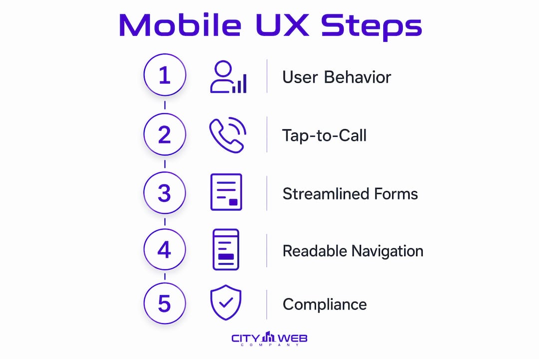
Table of Contents
What is mobile optimization for law firms, and why does it differ from mobile-friendly design?
Mobile-friendly and mobile-optimized are not the same thing. Most law firm websites pass Google’s mobile-friendly test because they use responsive design for lawyers, meaning the layout reflows to fit a smaller screen. Responsive design is the baseline, not the finish line.
A truly mobile-optimized site is built around how legal clients actually behave on a phone. Legal clients access sites in high-stress scenarios requiring immediate, frictionless contact options. Someone searching for a DUI attorney at 11 PM or a personal injury lawyer from a hospital waiting room is not browsing casually. They need a phone number they can tap, a form they can complete in under two minutes, and content they can scan in seconds.
The distinction comes down to intent design. A mobile-friendly site shrinks content to fit. A mobile-optimized site rebuilds the experience around the mobile user’s goal. True mobile optimization starts from the smallest screen, typically 375px width, and designs outward. Every element earns its place based on whether it helps a stressed, distracted person contact your firm faster.
Here is what separates a mobile-optimized law firm site from one that is merely responsive:
- Tap-to-call is prominent and always visible. A phone number coded with a
tel:link sits in a sticky header, not buried in the footer. - Navigation reaches any page in two taps. Long dropdown menus that require precise finger placement fail on mobile.
- Content is scannable. Short paragraphs, bold subheadings, and bullet points replace dense legal prose.
- Forms are short. Intake forms ask for only what is necessary to start a conversation.
- Load time is fast. Every second of delay costs conversions, and mobile networks are slower than broadband.
Pro Tip: Test your firm’s website on a real Android or iPhone, not a desktop browser’s device simulator. Simulators miss touch-target sizing errors, font rendering issues, and real-world load times on cellular connections.
How does site speed affect mobile conversions for law firms?
Site speed is the single most controllable variable in mobile conversion performance. A one-second delay causes a 20% drop in conversions, and sites loading under two seconds convert 25% more visitors than slower competitors. For a law firm receiving dozens of mobile inquiries per week, that math compounds quickly.


Google measures site speed through Core Web Vitals, a set of three performance benchmarks that directly influence search rankings. The targets for 2026 are:
| Metric | Full Name | Target |
|---|---|---|
| LCP | Largest Contentful Paint | Under 1.5 seconds |
| FID | First Input Delay | Under 50 milliseconds |
| CLS | Cumulative Layout Shift | Under 0.1 |
Meeting these benchmarks requires deliberate technical work, not just a faster hosting plan. The most effective changes are:
- Convert images to WebP format. WebP images and lazy loading reduce image payload by 25–35%, cutting load time without sacrificing visual quality.
- Defer non-critical JavaScript. Scripts that load analytics, chat widgets, or ad trackers should not block the page from rendering.
- Host videos externally. Embedding self-hosted videos on mobile pages destroys load speed. Responsive YouTube embeds load faster and perform better on cellular connections.
- Minimize third-party scripts. Every external script adds a network request. Audit and remove any script that does not directly support conversion.
- Use a content delivery network (CDN). A CDN serves your site files from servers geographically close to the visitor, reducing latency.
Pro Tip: Run your firm’s site through Google PageSpeed Insights and focus on the “Opportunities” section first. Those are the fixes with the highest speed impact, ranked by estimated savings.
High Core Web Vitals scores do not guarantee top rankings on their own. Strong scores improve ranking potential when combined with quality content and authoritative links. Speed is necessary but not sufficient. It removes a barrier; it does not replace substance.
What are the best mobile UX practices for legal client websites?
Mobile user experience design for law firms requires thinking about the physical and emotional state of the person holding the phone. A prospective client in a legal crisis is not patient. Every extra tap, every hard-to-read font, and every form field that does not auto-fill is a reason to leave.
Tap-to-call placement and contact visibility
Click-to-call buttons are the highest converting element on a law firm’s mobile site, yet many firms hide them or make them non-tappable images. The phone number must appear in a sticky header that stays visible as the user scrolls. It must use a tel: link so tapping it immediately dials. This single fix consistently produces measurable increases in inbound calls.
Form design that reduces abandonment
Mobile intake forms should be limited to five fields to prevent abandonment. The five fields that matter most are: name, phone number, email, practice area, and a brief description of the situation. Everything else can be collected during the intake call. Simplified forms with auto-fill support and smart keyboard triggers, such as showing a numeric keypad for phone fields, significantly boost completion rates in legal intake scenarios.
Navigation and readability standards
Navigation menus must be thumb-friendly, avoiding tiny hamburger menus that require precise tapping. The best mobile law firm sites use large touch targets, at least 44 pixels tall, and limit the primary menu to five or six items. Text must be legible without zooming, which means a minimum of 16px body font size and strong contrast between text and background.
Here are the core UX elements every mobile law firm site needs:
- Sticky header with tap-to-call button and firm name
- Practice area links accessible within two taps from the homepage
- Body text at 16px or larger with high contrast
- Intake form with five fields maximum and auto-fill enabled
- Attorney credentials and bar disclaimers visible without excessive scrolling
Pro Tip: Ask a non-lawyer friend to find your firm’s phone number and submit a contact form on their phone while you watch. You will discover friction points in under three minutes that no audit tool would flag.
Compliance within limited screen space
Google classifies legal content as YMYL (Your Money or Your Life) and requires high E-E-A-T signals, meaning attorney credentials and disclaimers must remain visible on all devices, including mobile. State bar advertising rules also require formal disclaimers and transparent attorney information on every page. The solution is not to hide this content behind a tap. Use a collapsible footer section or a persistent “Attorney Advertising” label that does not clutter the primary conversion path.
How does mobile content and SEO drive more leads for law firms?
Mobile content strategy for law firms starts with one rule: answer the question before the user has to scroll. A prospective client searching “car accident lawyer near me” on a phone expects to see your practice area, your location, and a way to contact you above the fold. If they have to scroll past a hero image and a firm history paragraph first, many will leave.
Structured data markup is one of the most underused tools in SEO for law firms. Implementing LocalBusiness schema tells Google your firm’s name, address, phone number, and hours. Adding FAQPage schema to practice area pages can generate rich results in mobile search, placing your answers directly in the search results page before the user even visits your site. These schema types work together to capture mobile searchers at the moment of highest intent.
The table below shows how mobile content strategy differs from desktop content strategy for law firm pages:
| Content element | Desktop approach | Mobile-optimized approach |
|---|---|---|
| Hero section | Large image with tagline | Compact headline with tap-to-call button |
| Practice area intro | 200-word overview paragraph | 2-3 sentence answer, then bullet points |
| Attorney bio | Full career history | Name, credentials, photo, and bar number |
| Testimonials | Static text block | Swipeable cards with permitted client info |
| FAQs | Accordion at page bottom | Prominent section near top of page |
Local SEO and mobile search are inseparable for law firms. Optimizing your Google Business Profile in coordination with your mobile site ensures that your firm appears in the local map pack, which dominates mobile search results for location-based legal queries. Keep your profile’s phone number, hours, and practice areas consistent with what appears on your mobile site. Inconsistency signals unreliability to both Google and prospective clients.
For firms looking to go further, AI-driven content strategies are now being applied to mobile SEO for legal sites, helping firms identify which practice area questions mobile users ask most and structure content to answer them directly. The approach pairs well with FAQPage schema to maximize mobile search visibility.
The numbered steps for a mobile content audit are:
- Open each practice area page on a phone and note what appears before the first scroll.
- Check that the page answers the primary search query in the first two sentences.
- Verify that a tap-to-call button or contact form appears above the fold.
- Confirm that
LocalBusinessandFAQPageschema are implemented and error-free in Google Search Console. - Review swipeable testimonial sections to confirm they display permitted client information only.
Key Takeaways
A mobile-optimized law firm website converts 40% more visitors than a desktop-first site adapted for mobile, making mobile performance a direct revenue driver, not a technical afterthought.
| Point | Details |
|---|---|
| Mobile-friendly is not enough | Responsive design reflows content but does not optimize for conversion or user behavior. |
| Speed drives conversions | Sites loading under two seconds convert 25% more visitors; a one-second delay costs 20% of conversions. |
| Tap-to-call is the top converter | Place a tel: link in a sticky header on every page to capture high-intent mobile callers. |
| Short forms reduce abandonment | Limit mobile intake forms to five fields and enable auto-fill to maximize completions. |
| Schema and local SEO multiply reach | Implement LocalBusiness and FAQPage schema alongside a complete Google Business Profile to dominate mobile local search. |
What law firms consistently get wrong about mobile optimization
The most common mistake I see managing partners make is signing off on a website redesign, confirming it “looks good on mobile,” and calling the project done. Looking good on mobile and performing on mobile are entirely different outcomes. A site can pass every visual check and still bleed leads because the phone number is an image, the form has twelve fields, or the page takes four seconds to load on a 4G connection.
The second mistake is testing on the wrong device. Desktop browser simulators do not replicate real touch behavior, real network conditions, or real font rendering. I have watched firms spend significant money on redesigns that had obvious usability failures that would have been caught in ten minutes of testing on an actual phone.
The third mistake is treating mobile optimization as a one-time project. Mobile usage patterns shift, Google updates its Core Web Vitals thresholds, and new device sizes enter the market. A law firm’s mobile site needs quarterly performance reviews, not annual ones. The firms that win mobile lead generation treat it as an ongoing business function, not a completed checkbox.
The emotional context of legal clients is the factor most often ignored. A person searching for a bankruptcy attorney or a criminal defense lawyer is under real stress. Every second of load time, every confusing navigation tap, and every form field they did not expect adds friction at the worst possible moment. Mobile optimization for legal sites is not just a technical discipline. It is an act of meeting a client where they are, when they need you most.
— Matt
How City Web Company helps law firms win on mobile
Law firms that want real results from their mobile presence need more than a responsive template. City Web Company builds mobile-first law firm websites designed around conversion, speed, and the specific behavior of legal clients on phones.
City Web Company’s approach covers Core Web Vitals compliance, thumb-friendly navigation, five-field intake forms, tap-to-call implementation, and local SEO integration from the ground up. Every site is tested on real devices, not simulators. The result is a mobile law firm site that ranks, loads fast, and turns visitors into consultations. If your firm’s mobile performance is not generating the leads it should, explore City Web Company’s law firm digital marketing services to see what a conversion-focused build looks like in practice.
FAQ
What is mobile optimization for a law firm website?
Mobile optimization is the process of designing a law firm’s website so that mobile visitors can find information, contact an attorney, and complete intake forms quickly and without friction. It goes beyond responsive design to address speed, navigation, form length, and conversion path clarity.
How much does mobile site speed affect law firm leads?
A one-second delay in mobile load time causes a 20% drop in conversions, and sites that load under two seconds convert 25% more visitors than slower sites. For law firms, that directly translates to more or fewer client inquiries per week.
What is the ideal number of fields on a mobile intake form?
Mobile intake forms should be limited to five fields to prevent abandonment. Name, phone number, email, practice area, and a brief situation description are sufficient to start the intake process.
Does Google rank law firm websites based on mobile performance?
Google’s mobile-first indexing means it evaluates and ranks websites based on their mobile version, not the desktop version. A law firm with a slow or poorly structured mobile site will rank lower than competitors with faster, better-organized mobile experiences.
What schema markup should law firms use for mobile SEO?
Law firms should implement LocalBusiness schema to confirm location and contact details, and FAQPage schema on practice area pages to generate rich results in mobile search. Both types increase visibility before a user even clicks through to the site.
Recommended
These articles were popular with other readers too: