

Pass Google Business verification with a video-first checklist. Film one continuous 30 second take, fix flagged issues, and know when to hire help.
Why Mobile Optimization Matters for Your Business Website
If your website is not optimized for mobile, you are losing customers right now. Over 57% of global web traffic comes from mobile devices, and Google ranks your site based on its mobile version, not desktop. The single most important next step: run a free audit on Google PageSpeed Insights and Google’s Mobile-Friendly Test today, then share the results with your developer or agency within 72 hours.
Before that conversation, have three things ready:
- Admin access to your website’s CMS or hosting panel
- A list of priority pages (homepage, service pages, contact/booking page)
- A performance baseline — your current mobile PageSpeed score, bounce rate, and mobile conversion rate from Google Analytics
Table of Contents
Table of Contents
- What Does Mobile Optimization Actually Include?
- Key Elements of Mobile Optimization Every Site Must Cover
- How Mobile Optimization Affects Your Business Outcomes
- Step-by-Step Practical Optimizations and Common Mistakes
- What Tools Should You Use to Test Mobile Performance?
- KPIs to Track, Expected Timeline, and Typical Costs
- Real-World Impact: What the Numbers Show
- Your Quick-Win Checklist: 10 High-Impact Actions
- Key Takeaways
- The Honest Agency Perspective on Where to Start
- City Web Company Builds Mobile Experiences That Drive Local Leads
- Useful Sources and Testing Tools
- FAQ
What Does Mobile Optimization Actually Include?
Most business owners hear “mobile optimization” and picture shrinking a desktop site to fit a phone screen. That is responsive design, and it is only the starting point.
Mobile optimization means improving every layer of how a mobile user experiences your site: the layout, yes, but also how fast pages load on a cellular connection, whether buttons are large enough to tap without zooming, whether your forms work on a touchscreen keyboard, and whether Google can actually read and index your content when it crawls with a smartphone user agent.
The full scope includes:
- Responsive vs. mobile-first design: Responsive adapts a desktop layout; mobile-first builds for the smallest screen first and scales up
- Progressive Web Apps (PWAs): App-like experiences that load fast and work offline
- Server-side performance: Hosting speed, time to first byte, and CDN configuration
- Touch UX: Tap target sizing, swipe gestures, and thumb-friendly navigation
- Content parity: Every piece of content visible on desktop must be accessible on mobile, or Google may not index it
A site can pass a basic mobile-friendliness check and still fail its users. If your navigation requires a precise tap on a tiny link, your form fields are too small to type in comfortably, or your hero image takes four seconds to load on LTE, you have a mobile problem regardless of what the responsive checkbox says.
Google’s mobile-first indexing means the mobile version of your site is the version that determines your search rankings. If your mobile site is stripped down, slow, or hides content behind collapsed tabs, that directly harms where you appear in search results.
Key Elements of Mobile Optimization Every Site Must Cover
Think of this as a prioritized checklist, not a wish list. The items at the top have the biggest impact on both rankings and revenue.
Core technical and UX elements:
- Responsive or mobile-first layout with correct viewport meta tag (
<meta name="viewport" content="width=device-width, initial-scale=1">) - Page speed meeting Core Web Vitals thresholds (LCP under 2.5 seconds, CLS under 0.1, FID/INP under 200ms)
- Compressed images in next-gen formats (WebP or AVIF)
- Touch-friendly UI: tap targets at least 44×44 pixels, adequate spacing between links
- Simplified navigation: no mega-menus, hamburger menu with clear labels
- Mobile-optimized forms: large input fields, minimal required fields, autofill-enabled
- Local SEO signals: click-to-call buttons, Google Maps embed, NAP consistency
- Content parity: no content hidden exclusively on mobile that exists on desktop
Quick wins for developer handoff:
- Convert all images to WebP and add lazy loading attributes
- Enable browser caching and GZIP compression at the server level
- Remove or defer unused JavaScript and CSS
- Replace any fixed-width elements that cause horizontal scrolling
- Test and fix all tap targets flagged in Google Search Console
Pro Tip: Responsive design is not the finish line. Many sites pass mobile usability checks yet still fail real users because touch targets are too small, menus are too complex, or important CTAs are buried below the fold on a phone screen. Always test on an actual device, not just a browser emulator.
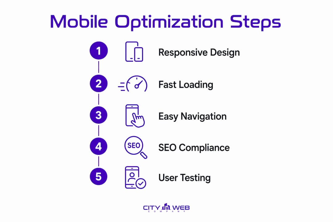
How Mobile Optimization Affects Your Business Outcomes
The business case for mobile optimization is direct. Roughly 53% of mobile visitors abandon a page that takes more than three seconds to load. That is more than half your potential customers gone before they read a single word.
For local service businesses, the stakes are even higher. 76% of local mobile searches result in a store visit or contact within 24 hours. Someone searching “HVAC repair near me” on their phone at 7 PM is ready to call. If your site loads slowly or your phone number is not tappable, they call your competitor instead.
Hard benefits you can expect from a properly optimized mobile site:
- Lower bounce rate from mobile visitors
- Higher mobile conversion rate (calls, form fills, bookings)
- Better local search rankings through improved Core Web Vitals signals
- More time on site and pages per session from mobile users
- Increased Google Business Profile clicks and map interactions
The SEO mechanics work like this: Google crawls your site using a mobile user agent. It measures your Core Web Vitals, checks content parity, and evaluates usability signals. A slow, hard-to-use mobile site gets lower rankings, which means less traffic, which means fewer leads. The importance of mobile optimization is not theoretical; Google has made it a direct ranking factor.
Pro Tip: Check your local SEO performance alongside your mobile audit. Local search and mobile search overlap heavily, and fixing one often accelerates the other.


Step-by-Step Practical Optimizations and Common Mistakes
Priority-ordered optimization roadmap
- Audit first. Run Google PageSpeed Insights, Lighthouse, and the Mobile-Friendly Test. Export the results. Do not start fixing things randomly.
- Compress and convert images. Switch to WebP format, add
loading="lazy"to all below-the-fold images, and set explicit width and height attributes to prevent layout shift. - Enable caching and compression. Configure browser caching headers and enable GZIP or Brotli compression at the server or CDN level.
- Deliver critical CSS inline. Load only the styles needed for above-the-fold content first; defer the rest. This directly improves Largest Contentful Paint.
- Audit and reduce third-party scripts. Tag managers, chat widgets, and ad pixels add significant load time on mobile networks. Audit each one and remove anything that does not directly drive revenue.
- Fix navigation for thumbs. Replace desktop mega-menus with a clean hamburger menu. Keep the primary CTA (call, book, quote) visible without scrolling.
- Optimize forms. Reduce fields to the minimum needed. Use
type="tel"for phone fields andtype="email"for email fields so mobile keyboards switch automatically. - Verify content parity. Open every key page on a real phone and confirm that all text, CTAs, and trust signals visible on desktop are also visible on mobile.
Common mistakes that kill mobile conversions
- Hiding important content behind collapsed tabs or accordions that Google may not index
- Desktop-only assets like wide tables, large PDFs, or Flash-based elements
- Tiny touch targets that require precise tapping, especially in navigation and forms
- No click-to-call button on the homepage and contact page
- Pop-ups that cover the full screen on mobile (Google penalizes these as intrusive interstitials)
- Uncompressed hero images that add two or more seconds to load time
Developer handoff ticket template: Include your PageSpeed Insights URL, your current LCP and CLS scores, a list of flagged issues from Lighthouse, and the specific pages to prioritize. State the target thresholds (LCP under 2.5s, CLS under 0.1) so the developer has a clear pass/fail criterion.
What Tools Should You Use to Test Mobile Performance?
Testing is where most teams cut corners. Running one tool once and calling it done is how sites stay broken for months.
Must-use tools and what each one tells you:
- Google PageSpeed Insights: Combines lab data (Lighthouse) with real-world field data from the Chrome User Experience Report (CrUX). Always check the mobile tab specifically.
- Lighthouse: Built into Chrome DevTools. Run it under throttled mobile conditions (Moto G4 preset) for a realistic picture of performance on mid-range devices.
- Chrome DevTools: Use the Device Toolbar to simulate different screen sizes and the Network tab to throttle to “Fast 3G” or “Slow 3G” and see what real users experience.
- Google Mobile-Friendly Test: Confirms whether Google can render and read your page on mobile. A pass here is necessary but not sufficient.
- BrowserStack: Real-device cloud testing across hundreds of actual phones and tablets. Use it to catch rendering bugs that emulators miss, especially on older Android devices.
- Real-device testing checklist: Test on at least one older Android (3–4 years old), one current iPhone, and one mid-range Android. Test on Wi-Fi and on LTE with one bar of signal.
Key metrics and target thresholds:
| Metric | What It Measures | Target Threshold |
|---|---|---|
| Largest Contentful Paint (LCP) | How fast the main content loads | Under 2.5 seconds |
| Cumulative Layout Shift (CLS) | Visual stability during load | Under 0.1 |
| First Contentful Paint (FCP) | When the first element appears | 2.5 seconds |
| Time to First Byte (TTFB) | Server response speed | Under 200ms |
| Total Blocking Time (TBT) | Main thread blocking from scripts | Under 200ms |
Always cross-reference lab scores with field data in PageSpeed Insights. A perfect Lighthouse score on a fast desktop connection means nothing if real users on mobile are seeing a 6-second LCP.

KPIs to Track, Expected Timeline, and Typical Costs
KPIs tied to business outcomes
- Mobile traffic share (target: understand your baseline, then track trend)
- Mobile conversion rate (calls, form fills, bookings from mobile sessions)
- Mobile bounce rate (a drop here signals real UX improvement)
- LCP, CLS, and TBT (technical health; track weekly during optimization)
- Time to interactive (how long before a user can actually tap and interact)
- Pages per mobile session (engagement signal)
- Phone calls and map clicks from Google Business Profile (direct revenue signal)
Timeline and cost expectations
| Phase | Timeline | Typical Work | Estimated Cost Range |
|---|---|---|---|
| Quick wins (images, caching, scripts) | 0–2 weeks | Image compression, caching config, script audit | — |
| Medium-term fixes (CSS, nav, forms) | 2–8 weeks | Critical CSS, navigation rebuild, form optimization | — |
| Long-term (rebuild or PWA) | 2–6 months | Mobile-first redesign or full site rebuild | — |
Cost varies significantly based on your platform (WordPress, custom build, Shopify), the number of pages, and whether you need a full redesign or targeted fixes. A local service business with a 10–15 page site can often see meaningful improvement from quick wins alone.
Real-World Impact: What the Numbers Show
The behavioral data behind mobile optimization is not abstract. Mobile users are often in the moment, searching with intent to act. A plumber, HVAC company, or pest control service that loads in under two seconds and shows a tappable phone number captures that call. One that loads in five seconds does not.
Consider what this looks like in practice for a local service business:
- A home services company fixes image compression and caching. Mobile load time drops from 6.2 seconds to 2.4 seconds. Mobile bounce rate falls. Phone calls from the website increase.
- A med spa rebuilds its booking form for mobile. The form went from eight fields to four, with autofill enabled. Mobile form completions rise significantly within the first month.
- A pest control company adds a sticky click-to-call button visible on all mobile pages. Direct calls from the website increase without any change to ad spend.
When a local business loses a mobile visitor in the first three seconds, it rarely gets a second chance. That user does not come back later on a desktop. They call the next result on the list. Mobile optimization is not a technical project; it is a revenue protection decision.
The UX and credibility link is equally important: users who have a poor mobile experience are far less likely to return, which means a slow or broken mobile site damages your brand reputation, not just your bounce rate. For mobile-friendly SEO to pay off, the experience has to hold up on real devices under real conditions.
Your Quick-Win Checklist: 10 High-Impact Actions
Assign each item to your developer with the micro-instruction provided. Effort ratings are relative to each other.
- Convert images to WebP format. Run all images through Squoosh or ShortPixel and re-upload. Effort: Low. Impact: High.
- Add lazy loading to all below-the-fold images. Add
loading="lazy"to every<img>tag not in the first viewport. Effort: Low. Impact: High. - Enable GZIP or Brotli compression. Add compression rules to your
.htaccessfile or configure at the CDN level. Effort: Low. Impact: Medium. - Set browser caching headers. Configure
Cache-Controlheaders for static assets (images, CSS, JS) to cache for at least 30 days. Effort: Low. Impact: Medium. - Remove or defer unused plugins and scripts. Audit installed plugins and third-party scripts; remove anything not actively used. Effort: Medium. Impact: High.
- Simplify mobile navigation. Replace any multi-level dropdown with a clean hamburger menu. Limit top-level items to five or fewer. Effort: Medium. Impact: High.
- Add a sticky click-to-call button. Place a tappable phone number button that stays visible as users scroll on all key pages. Effort: Low. Impact: High.
- Fix CTA placement above the fold. On mobile, your primary call to action (call, book, get a quote) must be visible without scrolling. Effort: Low. Impact: High.
- Reduce form fields to the minimum. Cut any field that is not required to qualify the lead. Enable autofill attributes. Effort: Low. Impact: Medium.
- Set explicit image dimensions. Add
widthandheightattributes to every image to prevent layout shift (CLS). Effort: Low. Impact: Medium.
For a deeper walkthrough of making these changes, the City Web Company guide on making a website mobile-friendly covers the technical steps in plain language.
Key Takeaways
Mobile optimization directly protects your search rankings and revenue because Google ranks your site based on its mobile version, and most of your visitors arrive on a phone.
| Point | Details |
|---|---|
| Mobile-first indexing is live | Google uses your mobile site to set rankings; a poor mobile version hurts your position regardless of desktop quality. |
| Speed is the first conversion lever | Roughly 53% of mobile visitors leave if a page takes more than 3 seconds to load. |
| Local intent converts fast | 76% of local mobile searches lead to a contact or visit within 24 hours, making mobile UX a direct revenue driver for service businesses. |
| Responsive design is not enough | Touch targets, content parity, and form usability must be explicitly designed for mobile, not assumed from a responsive layout. |
| City Web Company can handle this | City Web Company audits, fixes, and rebuilds mobile experiences for local service businesses, from quick wins to full mobile-first redesigns. |
The Honest Agency Perspective on Where to Start
Most business owners come to us after months of watching their mobile traffic bounce at a high rate, not knowing why. The answer is almost always the same: the site was built for desktop and “made responsive” as an afterthought, which means it technically passes a mobile check but fails real users in a dozen small ways.
My recommendation is always to audit before you rebuild. A full site rebuild is expensive and takes months. But in many cases, fixing images, simplifying navigation, and adding a click-to-call button delivers 70% of the improvement at 10% of the cost. Start there.
Where a rebuild makes sense: if the site is more than four years old, built on a page builder that generates bloated code, or if the mobile experience is fundamentally broken (horizontal scrolling, unreadable text, broken forms), the quick-win path will not get you to competitive Core Web Vitals scores. At that point, a mobile-first rebuild is the right investment.
One caution worth naming: do not let a vendor sell you a mobile “optimization” that is just a plugin install and a theme switch. Real mobile optimization requires testing on actual devices, measuring field metrics, and iterating based on real user data. If an agency cannot show you before-and-after PageSpeed scores and CrUX field data, they have not actually optimized anything.
For vertical-specific context, City Web Company’s mobile optimization guide for law firms shows how the same principles apply across different service industries.
City Web Company Builds Mobile Experiences That Drive Local Leads
Local service businesses that fix their mobile experience see a direct lift in calls, form fills, and map clicks. City Web Company handles the full process: mobile audit, prioritized fixes, and where needed, a mobile-first redesign built to pass Core Web Vitals and convert visitors into customers.

The initial consultation covers your current mobile PageSpeed scores, the top three issues costing you conversions, and a prioritized fix plan you can act on immediately. City Web Company works with HVAC companies, plumbers, pest control services, med spas, landscapers, and other local service businesses across the country.
Ready to see what your mobile site is actually costing you? Get a mobile audit from City Web Company, or explore the full range of web design and development services to see what a mobile-first rebuild looks like for your business.
Useful Sources and Testing Tools
Use these tools to run your own audit and validate improvements:
- Google PageSpeed Insights: Start here. Run your homepage and top service pages on the mobile tab. Records both lab and field data.
- Lighthouse: Built into Chrome DevTools (F12 > Lighthouse tab). Use the “Mobile” device setting and “Simulated throttling” for a realistic score.
- Google Mobile-Friendly Test: Confirms whether Google can render your page. Use it for every key page, not just the homepage.
- BrowserStack: Test on real devices. Particularly useful for catching bugs on older Android phones that emulators miss.
- Chrome DevTools: Use the Device Toolbar and Network throttling to simulate real mobile conditions. The Performance tab shows exactly where load time is being spent.
- City Web Company audit: If you want a professional review with prioritized recommendations, contact City Web Company for a mobile performance audit tailored to local service businesses.
FAQ
Why does mobile optimization matter for search rankings?
Google uses mobile-first indexing, meaning it evaluates and ranks your site based on the mobile version. A slow or incomplete mobile site directly lowers your position in search results.
Why do I need to optimize my phone’s website experience?
Most of your visitors arrive on a phone, and roughly 53% will leave if the page takes more than three seconds to load. A poor mobile experience loses leads before they ever read your offer.
Why is mobile navigation so important for usability?
Mobile users navigate with one thumb on a small screen. Complicated menus, tiny tap targets, and buried CTAs force users to work harder than they will. Simplified navigation with large, clearly labeled buttons keeps users moving toward a conversion.
Why will mobile search keep growing in importance?
Mobile devices are the primary way people access the internet, and local search behavior is almost entirely mobile-driven. As voice search and AI-powered search results expand, the mobile experience becomes the default context for nearly every search interaction.
Is mobile optimization necessary if my site already looks fine on a phone?
Looking fine and performing well are different things. A site can render correctly on mobile and still have slow load times, poor Core Web Vitals scores, and UX issues that reduce conversions. Use Google PageSpeed Insights to check performance, not just appearance.
Recommended
These articles were popular with other readers too: