
Discover the types of paid adslocal businesses can use in 2026. Learn strategies to maximize your ad spend and reach your target customers!
Stop Letting X Crop Your Profits: A Guide to Twitter Post Image Sizes
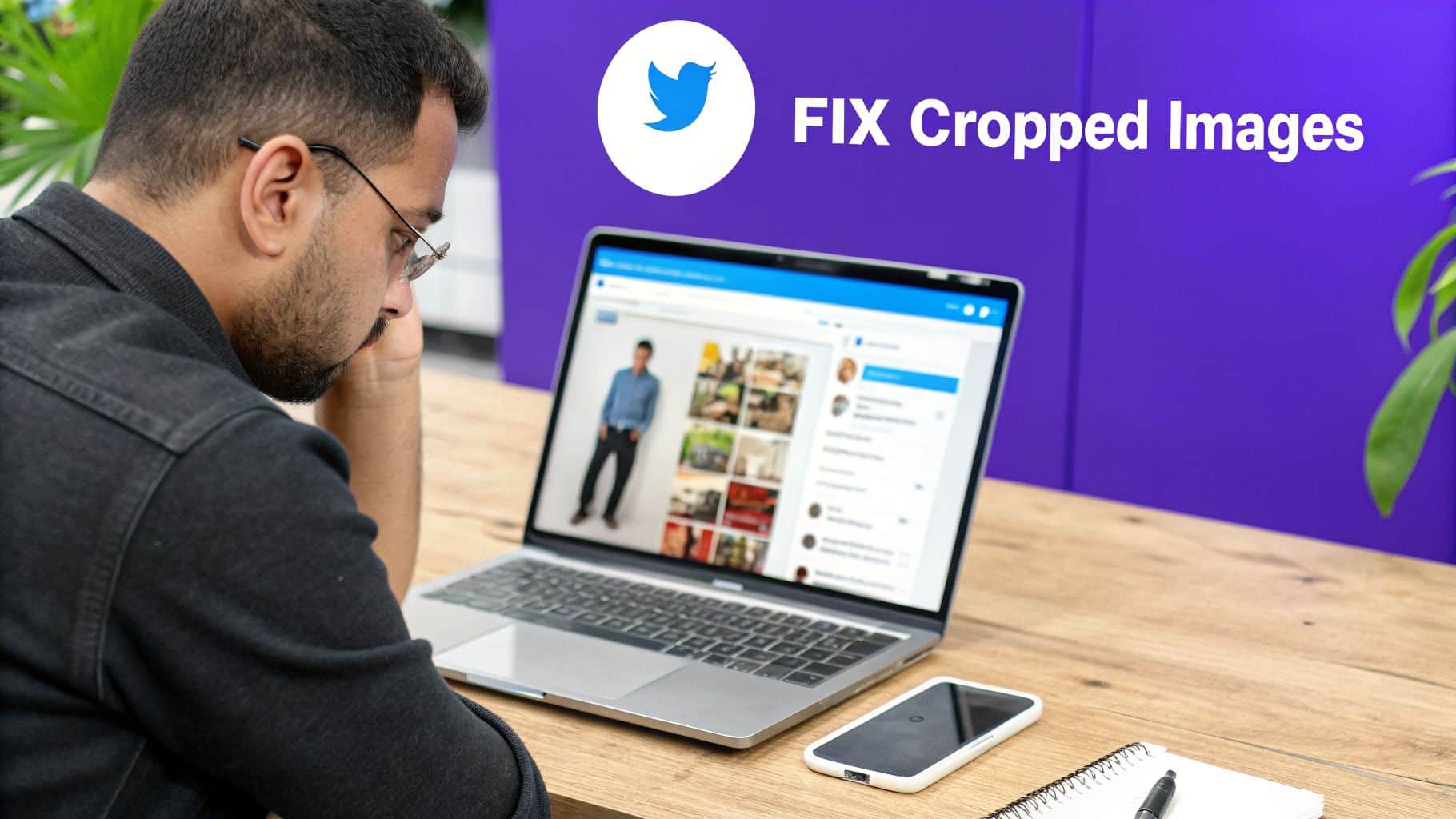
Many business owners treat social media images as an afterthought, uploading photos and assuming platforms like X (formerly Twitter) will just figure it out. This common oversight is more than a simple mistake; it's an unforced error that directly damages your brand's credibility and wastes marketing spend.
The core issue is that when X automatically crops an improperly sized image, it can cut off your logo, hide critical promotion details, or weaken the entire message. For a local business, this signals a lack of professional polish. It’s a quiet problem that erodes trust and undermines your growth efforts before a potential customer even clicks on your profile.
This isn’t a minor cosmetic issue. It’s a source of missed revenue.
Table of Contents
The Business Cost of Incorrect Twitter Image Sizes
Uploading a randomly sized photo isn't just a visual misstep; it's a direct hit to your marketing ROI. An HVAC company showing off a new installation or a dentist promoting a patient special loses all impact when the image is poorly framed.
The consequences are practical and costly.
How Cropped Images Impact Your Business
An incorrect image size actively works against your goals.
- Wasted Spend: If you're running paid ads, a badly cropped image means you are paying for impressions that fail to communicate your offer. Every dollar spent on an unclear visual is a dollar wasted.
- Lower Engagement: Visuals drive interaction. Research shows that poorly formatted images can lose a significant portion of their visual message to automatic cropping, which directly harms likes, shares, and comments. You can find more data on this in Metricool's latest guide.
- Diminished Brand Authority: Consistency and attention to detail build credibility. When your visuals look amateurish, it creates a subtle perception that your services might be, too.
These small technical errors accumulate, costing your business visibility and potential revenue. The solution isn’t more marketing effort; it’s a more intelligent approach to the foundational details.
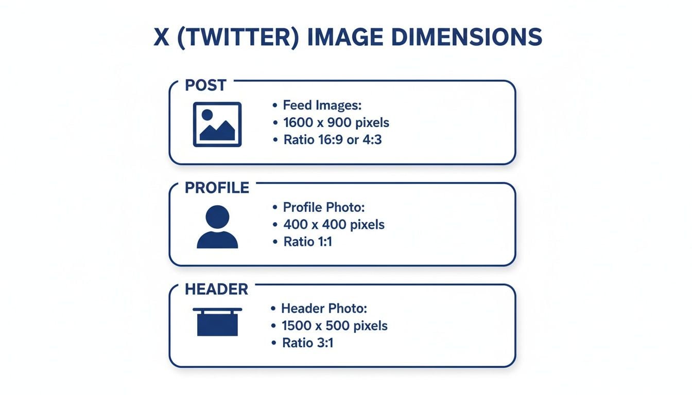
Your Quick Reference for X Image Dimensions
Here is a clear, concise breakdown of the essential image dimensions you need for the X platform. Adhering to these specifications is the simplest way to prevent awkward cropping and blurry visuals, ensuring your brand is always presented professionally.
X (Twitter) Image Size Cheat Sheet
| Image Type | Recommended Dimensions (Pixels) | Aspect Ratio | Notes |
|---|---|---|---|
| Profile Picture | 400 x 400 | 1:1 | This displays as a circle. Always keep your main logo or subject perfectly centered to avoid it being cut off. |
| Header Banner | 1500 x 500 | 3:1 | Expect some cropping on different devices. Place critical information in the center safe zone, away from the edges and bottom-left corner. |
| Single Image Post | 1600 x 900 | 16:9 | This is the ideal size for a standard landscape image. It will display fully in the feed without being collapsed. |
| Multi-Image (2) | 700 x 800 (each) | 7:8 | When you post two images, they will appear side-by-side in this vertical format. |
| Multi-Image (3) | 700 x 800 (left) & 1200 x 686 (right, stacked) | Mixed | For a three-image post, one tall image appears on the left with two smaller, stacked images on the right. |
| Link Preview (Card) | 800 x 418 | 1.91:1 | This image is pulled from your website's metadata. Correct configuration ensures your shared links look clean and clickable. |

Sticking to these numbers helps you sidestep the most common formatting issues businesses face on X. It is a simple check that makes a significant difference in how your brand is perceived.
Mastering Single Image Posts for Maximum Impact
The single image post is the workhorse of a sound X strategy. It’s direct and effective. Yet it’s also the easiest format to get wrong, and most businesses don't realize the platform is working against them.
The problem is predictable: you upload a well-designed graphic, but X's automatic cropping hides the most important part. A perfectly framed shot of a finished kitchen remodel now shows just a random cabinet. Your call to action is completely obscured. It makes your work look unprofessional and reduces engagement.
The Standard for In-Feed Images
To prevent auto-cropping and ensure your images display correctly on both desktop and mobile, you must use the 16:9 aspect ratio. This is the non-negotiable standard for in-feed images. Stick to it, and your entire visual will appear as intended in your followers' timelines.
For optimal results, create your images at 1600 x 900 pixels. This size provides the perfect 16:9 ratio and ensures your photos are crisp and high-resolution. It's the difference between a potential customer seeing the full scope of your work and them scrolling past a confusing, poorly cropped picture.
This infographic breaks down the most important dimensions you'll need for your X profile and posts.
Having one reliable size for all your single image posts simplifies your content creation and guarantees a professional look every time.
File Formats and Strategic Timing
Beyond size, the file format also matters. A good rule of thumb is:
- PNG: Use this for any graphics that include text, sharp lines, or your logo. PNGs keep these elements clear without compression artifacts.
- JPG: This is your best choice for photographs. A high-quality JPG offers great visual detail without creating a large file that loads slowly.
Posts with images receive more engagement than plain text. For a local service business, that visual proof is what can convince a customer to make contact. That only works if they can see what you’re showing them. Perfecting your image dimensions is the first step, and you can further improve impact when you schedule tweets on Twitter to post at optimal times.
Optimizing Your Profile and Header Images
Your X profile is a digital storefront. A blurry profile picture or a header with key information cut off sends an immediate, negative message. It suggests a lack of attention to detail, which can cause a potential customer to question the quality of your work before reading a single post.
Getting these two core brand assets right isn't just about aesthetics; it's about establishing professionalism from the first impression.

Profile Picture Dimensions
Your profile picture appears next to every post, on your main profile, and in search results. Consistency is essential.
- Recommended Size: 400 x 400 pixels
- Aspect Ratio: 1:1
- File Format: Use PNG for sharp logos; JPG works best for headshots or photographs.
The platform requires a square image but displays it as a circle. The most common mistake is placing a logo or design element too close to the corners, where it gets cropped. Always keep the most important part of your image centered to guarantee it remains fully visible.
Header Image and The Safe Zone
Your header image provides a larger canvas, but it is deceptively tricky. The dimensions are simple, but how X displays the image is not.
- Recommended Size: 1500 x 500 pixels
- Aspect Ratio: 3:1
The critical element most businesses miss is the safe zone. Your profile picture will always cover a portion of the bottom-left area of your header. Furthermore, X often crops a small amount from the top and bottom to fit different screen sizes.
For this reason, any essential information like your business name, tagline, or phone number must reside in the central area of the image. Do not place critical elements in the bottom third or tight against the top and bottom edges.
For example, a local roofer who places their "Licensed & Insured" text in the bottom-left corner of the header will find it completely blocked by the profile photo. By positioning that same information in the central safe area, they ensure every visitor sees it, regardless of device. This isn't just about specs; it's about ensuring your credibility is clearly visible.
Structuring Multi-Image and Link Preview Posts
While single images are powerful, sometimes a narrative requires more visuals. This is where multi-image posts are useful, and it's also where many businesses falter. Uploading several photos without a plan often creates a jumbled, unprofessional collage that buries your message.
X automatically arranges multiple images into specific grid layouts. If you fight this system, you will get awkward crops and visual chaos. But if you work with it, you can create a clean, compelling narrative. This structured approach is ideal for showing a process, before-and-after comparisons, or different angles of a completed project.
How to Build Multi-Image Grids
When you post more than one image, X organizes them into a collage. To control the final look, you must create your visuals to fit these preset slots.
- Two Images: The platform arranges them side-by-side. For this to look right, both images need to be created at 700 x 800 pixels (a 7:8 aspect ratio).
- Three Images: This layout gives you one large image on the left and two smaller ones stacked on the right. The main image on the left should be 700 x 800 pixels, while the two on the right should each be 1200 x 686 pixels.
- Four Images: This creates a clean 2×2 grid. To make it work, all four of your images should use a 16:9 aspect ratio, such as 1200 x 675 pixels.
Imagine a home remodeler showing a recent kitchen project. They could use a four-image grid for "Before," "During," "After," and a "Happy Client" shot. By sizing each one correctly beforehand, they create a professional and easy-to-follow story.
Optimizing Link Previews with X Cards
When you share a link to your website, X automatically pulls a preview called an X Card. This card grabs an image, title, and description from your site’s code. A missing or poorly cropped card image is a significant missed opportunity to earn a click.
The most common reason for a broken link preview is missing or incorrect metadata on your website. This is not something you fix on X; it must be configured in your website's backend.
To guarantee a clean preview every time, your website's designated card image should be set to a 1.91:1 aspect ratio, with a recommended size of 800 x 418 pixels. This ratio creates visual consistency with single-image posts.
From Technical Details to Sustainable Growth
Getting the correct Twitter post image sizes may feel like another technical task on a long checklist. It is more than that. It is a foundational step in moving away from the frustrating cycle of random posting and unpredictable results.
Mastering these specifications is about building a durable online presence. This attention to detail immediately separates a professional brand from an amateur one and is a core piece of a system that builds authority and trust. That same discipline applies across all marketing channels, including how you ensure your brand has one voice across every social platform.
The real issue for most businesses isn't a lack of effort; it's the lack of an integrated system. When your social media visuals, website experience, and search visibility work in unison, you stop chasing temporary engagement and start building sustainable growth.
This connects the "what" (the image specs) to the "why" (the long-term results you need). To confirm your optimized images are working, you must use tools like Twitter Analytics. The data you find there is what will help you refine your approach and make smarter decisions.
When you are ready to move from inconsistent efforts to a cohesive digital strategy, a strategic partner can provide the necessary structure. At City Web Company, we specialize in building these integrated systems, creating clarity and delivering consistent, measurable results.
Partnering for Strategic Execution
Mastering the technical details of a Twitter post image size is one thing. As a business owner, you know it's just one small piece of a much larger digital puzzle.
This is where many marketing plans fail. You can pour hours into creating the perfect post, but if it doesn't connect to a larger strategy, you are not achieving real business growth. The problem isn’t a lack of effort; it's the lack of a system that makes every action work together to acquire customers.
At City Web Company, we don’t just manage tasks; we build and manage the entire digital ecosystem for you. We act as your strategic partner, ensuring every element, from a single tweet to your website’s conversion funnel, is aligned. Our expertise in Pay-Per-Result SEO and comprehensive social media marketing provides the structure needed for sustainable growth.
If you are ready to trade fragmented tactics for a clear, integrated plan that grows your business, let's talk. We invite you to a no-obligation discovery call to discuss how a cohesive strategy can bring the clarity and results you deserve.
Frequently Asked Questions About X Image Sizes
We receive many questions from business owners about how X handles images. Getting these details right from the start saves considerable frustration and ensures your brand looks professional.
What Happens If I Upload a Portrait Image?
If you upload a tall, vertical image with an aspect ratio like 4:5 or 9:16, X will crop it for the in-feed preview. The platform automatically centers the image, meaning users will only see the middle portion unless they click to expand it. This is a gamble, as you risk cutting off important details at the top or bottom.
What Is the Best File Format for X Images?
The right file format depends on the image content. For the best balance of quality and loading speed, follow this simple rule:
- PNG: Use for graphics with text, your company logo, or sharp design elements. PNGs keep these details crisp and clean.
- JPG: This is your go-to for photographs. A high-quality JPG will capture detail while keeping the file size small for faster loading.
Do These Image Sizes Apply to Promoted Tweets?
Yes, for the most part. Many standard Promoted Tweets use the same image specifications as organic posts, such as the 16:9 single-image format. However, X offers ad formats with unique dimension requirements, especially for App Cards or Carousels. It is critical to match your images to the specific ad type. Failing to do so wastes ad spend on poorly displayed visuals. Always check the ad specifications before launching a campaign.
At City Web Company, we manage these technical details so you can focus on running your business. Our approach ensures every piece of your digital marketing works together to drive real, measurable growth. Schedule a no-obligation discovery call with us today to discuss how we can deliver the results you need.
These articles were popular with other readers too: