

Learn how to increase website conversions with actionable strategies. Fix your value proposition and prioritize A/B tests for quick gains.
Website Design Trends in 2026: Examples and What Works
The six highest-impact website design trends to prioritize in 2026 are kinetic typography, barely-there UI, Machine Experience (MX) readiness, nature-inspired tactile realism, purposeful 3D used sparingly, and performance-first mobile design. These aren’t aesthetic preferences — they’re patterns that major trend roundups consistently tie to measurable gains in engagement, trust, and lead generation.
Quick reference: the 2026 trends worth your time
- Kinetic typography: A single animated headline moment outperforms static type for attention and brand recall.
- Barely-there UI: Stripped interfaces reduce cognitive load and let content do the selling.
- Machine Experience (MX): Semantic markup and structured content now serve both human visitors and AI agents.
- Nature-inspired tactile realism: Warm textures and imperfect details signal human authorship and build trust faster than polished AI imagery.
- Purposeful 3D: Product exploration and brand storytelling benefit from 3D when assets are optimized; decorative 3D without a purpose slows pages and confuses users.
- Accessibility and performance first: These aren’t constraints, they’re the foundation every other trend must be built on.
The sections below cover each trend with real-world examples from sites like Airbnb, Stripe Press, Nike, and Shopify, a practical rollout checklist, a City Web Company case study with before-and-after metrics, and a testing matrix you can use on your next project.
Table of Contents
Key Takeaways
The highest-impact 2026 web design decisions are performance and accessibility fixes first, then purposeful visual trends layered on top.
| Point | Details |
|---|---|
| Performance gates conversion | LCP under 2.5 seconds and CLS under 0.1 are the floor every trend must be built on. |
| Accessibility is foundational | Resolve WCAG AA failures before adding visual complexity; they cost leads and create legal exposure. |
| Trends need a conversion purpose | Apply kinetic type, bento grids, and tactile realism only when they serve the primary conversion goal. |
| Machine Experience matters now | Semantic HTML and structured data serve both human visitors and AI agents reading your pages. |
| City Web Company approach | City Web Company audits performance and accessibility first, then applies 2026 trends to increase local leads. |
Table of Contents
- 1. Examples of website design trends in visuals and layouts
- 2. Typography trends: kinetic type, expressive headlines, and variable fonts
- 3. Interaction and immersion: scrollytelling, 3D, and microinteractions
- 4. AI and personalization that actually helps users
- 5. Accessibility, ethics, and sustainable design practices
- 6. Performance and mobile-first priorities: metrics and tactics
- 7. Real-world examples of modern sites that illustrate 2026 trends
- 8. How to pick and roll out trends for your 2026 project
- 9. City Web Company case study: applying 2026 trends to a local service site
- Why chasing trends without a conversion strategy is the fastest way to waste a redesign budget
- City Web Company builds websites that convert, not just impress
- Sources
- FAQ
1. Examples of website design trends in visuals and layouts
Visual design in 2026 is split between two poles: structured modularity and deliberate organic chaos. Knowing which pole fits your project is the first decision to make.
Bento grids: structure that scales
Bento grids organize content into variable-size panels that mirror natural scanning patterns. Think of Apple’s product pages or Notion’s feature breakdowns — each panel holds a distinct content type (headline, stat, visual, CTA) without competing for attention. The key implementation rule: write responsive reflow rules so the grid collapses gracefully on narrow viewports rather than stacking into an unreadable column.
Shopify’s merchant dashboard and marketing pages use bento-style panels to separate feature categories. Each panel is self-contained, which means a visitor scanning at speed still absorbs the core value proposition.
Organic and anti-grid layouts
Asymmetric, overlapping, and deliberately “broken” layouts signal creative confidence. They work for agencies, fashion brands, and portfolio sites where differentiation is the primary goal. For local service businesses — HVAC, pest control, med spas — they tend to hurt conversion because they create ambiguity about where to click next. Use organic layouts in hero sections only, then return to a predictable grid for service descriptions and CTAs.
WIRED’s editorial pages layer oversized type over photography with intentional overlap. The result is distinctive, but WIRED’s readers are there for content, not to convert on a service. Know your audience before you break the grid.
Color: dopamine palettes vs. earthy restraint
Bold, saturated “dopamine” palettes (electric greens, hot pinks, neon yellows) are everywhere in tech and DTC. They generate attention but can feel exhausting on longer pages. Nature-inspired palettes — warm terracotta, sage, off-white, deep forest green — are gaining ground specifically because they read as trustworthy and human-made. Designers report that warmer, imperfect textures and hand-crafted details outperform polished AI-generated imagery for trust signals.
Airbnb’s host-facing pages lean into warm photography and muted earth tones to communicate safety and belonging. The palette choice is a direct trust argument.
Glassmorphism and tactile realism
Frosted glass overlays, grain textures, and subtle paper-like surfaces add perceived depth without heavy 3D assets. The tradeoff is performance: CSS backdrop-filter can trigger GPU compositing on lower-end devices. Mitigate by applying glassmorphism to small, non-critical UI elements (cards, modals) rather than full-page backgrounds, and test on mid-range Android devices before shipping.
The shift away from generic AI imagery is one of the clearest signals in 2026 design. Tactile realism and small imperfections signal human authorship and increase trust compared to AI defaults that users now recognize on sight.
Pro Tip: Before committing to a maximalist visual style, run a five-second test with your actual target audience. If they can’t name the brand’s core service after five seconds, the visual style is working against conversion, not for it.
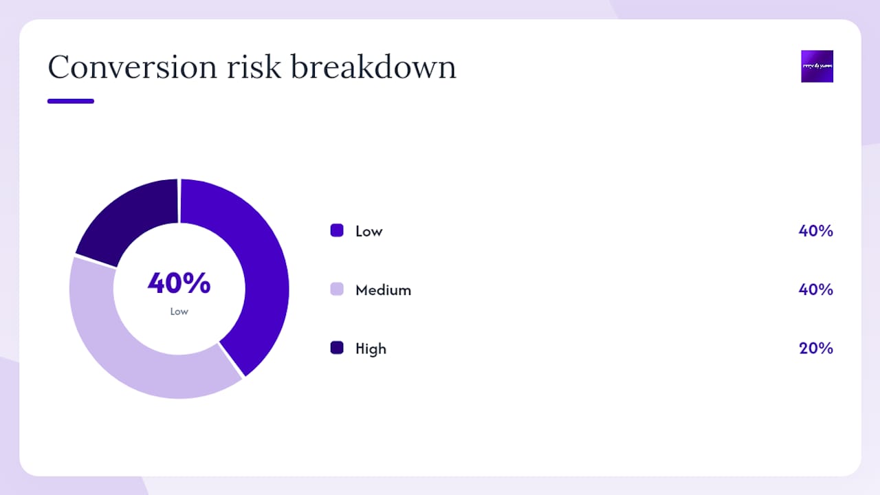
| Visual approach | Best fit | Conversion risk | Mitigation |
|---|---|---|---|
| Bento grid | SaaS, portfolios, feature pages | Low | Add responsive reflow rules |
| Organic/anti-grid | Creative agencies, fashion | High for service sites | Limit to hero; use grid below fold |
| Dopamine palette | Tech, DTC, youth brands | Medium (fatigue) | Cap to accent colors only |
| Earthy/nature palette | Local services, wellness, home | Low | Pair with strong CTA contrast |
| Glassmorphism | Cards, modals, overlays | Medium (GPU cost) | Apply to small elements only |
2. Typography trends: kinetic type, expressive headlines, and variable fonts
Typography is no longer just a readability decision. In 2026, it’s an interface layer.
What kinetic typography actually is
Kinetic typography means type that moves: weight shifts, characters that stretch, words that reveal on scroll. The most effective use is a single animated moment at the hero level. Practitioners recommend treating kinetic type as a hero-level statement rather than a repeating pattern, and always providing prefers-reduced-motion fallbacks for users who have motion sensitivity settings enabled.
Nike’s campaign pages frequently use a single large-type reveal in the hero — one word or phrase that animates in as the page loads. Below the fold, everything is static. That restraint is what makes the animation land.
Variable fonts: one file, many states
Variable fonts let you load a single font file and animate properties like weight and width in CSS. A standard setup might load four separate font files (regular, medium, bold, italic). A variable font replaces all of them, cutting HTTP requests and total font payload. Here’s a safe loading pattern:
@font-face {
  font-family: 'YourVariableFont';
  src: url('font.woff2') format('woff2-variations');
  font-weight: 100 900;
  font-display: swap;
}

/* Scroll-driven weight animation */
@keyframes weightShift {
  from { font-variation-settings: 'wght' 300; }
  to   { font-variation-settings: 'wght' 800; }
}

.hero-headline {
  animation: weightShift linear;
  animation-timeline: scroll();
}

@media (prefers-reduced-motion: reduce) {
  .hero-headline {
    animation: none;
    font-variation-settings: 'wght' 600;
  }
}
The font-display: swap line prevents invisible text during load. The prefers-reduced-motion block is not optional — it’s the accessibility floor.
Expressive headlines: size, contrast, and hierarchy
Oversized display type is standard on award-winning sites. The risk is readability on mobile. Test at 375px viewport width before finalizing any display size. FreshBooks uses large, confident headline type paired with a clean sans-serif body to separate its brand voice from generic SaaS competitors.
Variable fonts are the single highest-return typography investment for 2026. One file replaces multiple static font files, reducing payload while enabling the kind of smooth, scroll-driven weight transitions that previously required JavaScript.
Pro Tip: Test your variable font animation on a throttled 3G connection in Chrome DevTools before launch. If the font swap causes layout shift, add font-display: optional and serve a system font fallback for slow connections.
| Typography element | Performance impact | Accessibility requirement | Recommended tool |
|---|---|---|---|
| Variable font | Low (single file) | font-display: swap |
Google Fonts variable catalog |
| Kinetic type (CSS) | Low | prefers-reduced-motion |
CSS scroll-driven animations |
| Kinetic type (JS) | Medium | Same + test on low-power | GSAP with reduced-motion check |
| Oversized display | None | Test at 375px viewport | Figma responsive preview |
3. Interaction and immersion: scrollytelling, 3D, and microinteractions
Interactions are where 2026 sites win or lose users in the first 30 seconds.
Scrollytelling without scroll-jacking
Scrollytelling ties visual changes to scroll position: a map zooms in, a product assembles, a stat counts up. The critical rule is that it must react to scroll rather than control it. Scroll-jacking — where the page takes over scroll velocity — impairs performance and breaks the native browser experience. Use the Intersection Observer API or CSS scroll-driven animations to trigger changes at scroll thresholds without hijacking the scroll event.
Stripe Press executes this better than almost anyone. Its book pages use scroll-triggered chapter reveals and color transitions that feel cinematic without ever fighting the user’s scroll momentum.
3D and AR: purposeful, not decorative
WebGL and optimized 3D assets let designers add product exploration that reduces purchase hesitation. ASOS uses 360-degree product views to let shoppers examine garments from every angle — a direct conversion tool. Walmart’s product pages have tested 3D model views for select categories with measurable impact on add-to-cart rates.
The caution: a 3D hero animation that serves no product or narrative purpose adds load time without adding value. Compress 3D assets with Draco compression, lazy-load them below the fold, and always test on mid-range mobile.
Microinteractions: the details that reduce friction
A microinteraction is a small, contained response to a user action: a button that fills with color on hover, a form field that shakes gently on invalid input, a checkmark that animates on task completion. Slack’s notification badges and message-send animations are textbook examples. They confirm actions without interrupting flow.
Interactions should support the concept rather than draw attention to themselves. Purposeful microinteractions drive better lead generation for local service businesses because they reduce uncertainty at the exact moment a user is deciding whether to submit a form.
Pro Tip: Design microinteractions for touch first. A hover state that looks great on desktop is invisible on mobile. Use :focus-visible and touchstart events to ensure every interaction has a touch-equivalent state.
What to measure when you add interactions:
- Scroll depth (did users reach the CTA after the scrollytelling section?)
- Goal completions (form submissions, phone clicks) before and after
- Engagement rate in GA4 (sessions with meaningful interaction)
- Core Web Vitals, specifically CLS and INP, after adding animations
Cursor-driven interactions require early mobile planning because they degrade on touch devices. Plan the touch fallback in the design phase, not after development.
4. AI and personalization that actually helps users
Most AI features on websites in 2026 fall into one of two categories: genuinely useful or visibly gimmicky. The difference is whether the feature reduces friction for the user or just adds novelty for the brand.
Practical AI features worth building
- Progressive lead nurturing: A chat widget that asks two qualifying questions (service type, location, urgency) before routing to a human or a specific landing page. This reduces unqualified leads without adding friction for serious buyers.
- Content personalization: Showing a returning visitor the service category they browsed last session. Simple, low-risk, and implementable with a first-party cookie and a small JavaScript block.
- Conversational pre-qualifiers: A short quiz-style flow (“What’s your biggest challenge right now?”) that segments visitors and serves them a relevant case study or service page. Dropbox’s onboarding flow uses a version of this to route new users to the right product tier.
Machine Experience (MX): design for AI agents too
Machine Experience is the emerging discipline of making pages readable by AI agents — ChatGPT, Perplexity, Google’s AI Overviews — as well as by humans. The practical requirements overlap heavily with accessibility: semantic HTML, descriptive headings, structured data markup (Schema.org), and clean content hierarchy. A page that passes a screen reader audit is already most of the way to MX-ready.
Semantic HTML and structured content are now part of visual strategy, not just a developer concern. Designers who specify heading levels, landmark regions, and content order in their Figma files are already contributing to MX.
Pro Tip: Run your page through Google’s Rich Results Test after adding Schema.org markup. If the structured data parses cleanly, AI agents and search engines are reading your content the way you intended.
Privacy and ethical guardrails
- Collect only the data the personalization feature actually requires.
- Display a clear, plain-language consent prompt before activating behavioral tracking.
- Show users what data is being used and give them a one-click opt-out.
- Test fallback behavior: if personalization data is unavailable, the page must still convert on its own merits.
Implementation checklist for AI-driven features:
- Map data flows before writing a line of code.
- Define fallback content for every personalized element.
- Set up monitoring for poor personalization outputs (wrong service shown, irrelevant content surfaced).
- Review outputs monthly; AI-driven content can drift as training data changes.
5. Accessibility, ethics, and sustainable design practices
Accessibility moved from optional to foundational in 2026. Teams that treat it as a late-stage QA task consistently ship sites with WCAG violations that create legal exposure and hurt SEO. The fix is integrating accessibility into the design phase, not the testing phase.
Accessibility checklist for 2026 projects
- Color contrast: Minimum 4.5:1 for body text, 3:1 for large text (WCAG 2.1 AA). Test with the Colour Contrast Analyser or axe DevTools.
- Semantic markup: Use
<nav>,<main>,<article>,<section>, and heading levels in logical order. No<div>soup. - Keyboard navigation: Every interactive element must be reachable and operable by keyboard alone. Test by unplugging your mouse.
- ARIA roles: Add ARIA only where native HTML semantics are insufficient. Misused ARIA is worse than no ARIA.
- Readable typography: Minimum 16px body text, 1.5 line height, sufficient letter spacing for dyslexic readers.
- Alt text: Descriptive for informational images, empty
alt=""for decorative ones. - Motion: Respect
prefers-reduced-motionfor all animations and transitions. - Testing: Run automated checks with axe or Lighthouse, then follow up with manual keyboard and screen reader testing (NVDA on Windows, VoiceOver on macOS).
The W3C ethical web principles provide a broader framework: design should respect user autonomy, protect privacy, and avoid dark patterns. Embedding these principles in your design system’s component library is more reliable than checking for them at launch.
Pro Tip: Add an accessibility annotation layer to your Figma files. Label focus order, ARIA roles, and alt text directly on the design. Developers ship what they see in the spec; if accessibility isn’t in the spec, it won’t be in the build.
Sustainable web design: measurable choices
Sustainable web design means treating bandwidth and energy as finite resources. Practical steps:
- Convert images to AVIF or WebP; AVIF typically delivers 50% smaller files than JPEG at equivalent quality.
- Implement lazy loading for below-the-fold images and videos.
- Use edge caching (Cloudflare, Fastly) to reduce server round trips.
- Audit third-party scripts quarterly; unused tag manager scripts and chat widgets add significant payload.
- Measure your site’s carbon footprint with the Website Carbon Calculator and set a reduction target.
6. Performance and mobile-first priorities: metrics and tactics
A visually impressive site that scores below 50 on Google PageSpeed Insights loses leads before the design has a chance to work. Performance is not a developer concern — it’s a design constraint.
The metrics that matter
Optimization tactics that actually move the needle
- Image formats: Serve AVIF with WebP fallback using the
<picture>element. Never serve uncompressed PNGs for photographs. - Responsive images: Use
srcsetandsizesattributes so mobile devices download appropriately sized images. - Critical CSS: Inline the CSS required to render above-the-fold content; defer the rest.
- Code-splitting: Load JavaScript only when the component that needs it is in the viewport.
- Low-impact animation: CSS transforms and opacity changes are GPU-composited and don’t trigger layout recalculation. Avoid animating
width,height,top, orleft.
Pro Tip: Run Lighthouse in CI/CD so performance regressions are caught before they reach production. A budget of LCP under 2.5 seconds and CLS under 0.1 should be a merge gate, not an afterthought.
Mobile-first interaction design
Design for a 375px viewport and a thumb-operated interface first. Navigation items in the bottom 40% of the screen are reachable without repositioning the hand. Tap targets should be at least 44x44px. Progressive enhancement means the mobile experience is complete on its own; desktop gets additional visual richness layered on top.
7. Real-world examples of modern sites that illustrate 2026 trends
These ten sites are worth studying closely. Each one applies a specific trend with enough craft that you can reverse-engineer the decision.
Curated examples by trend:
- Airbnb (nature-inspired palette, trust-first photography): The hero uses warm, human photography with muted earth tones. Screenshot the hero composition and the color palette. The takeaway: for local service sites, warm photography of real people outperforms stock imagery every time. See how authentic visuals build trust for local businesses.
- Stripe Press (scrollytelling, cinematic experience): Scroll-triggered chapter reveals and color transitions that never fight the user’s scroll momentum. Capture the scroll state at three points in the page to study the transition logic. Takeaway: scrollytelling works when each scroll state has a clear narrative purpose.
- Nike (kinetic typography, bold palette): A single animated headline in the hero, static everywhere else. Screenshot the hero at load and at rest. Takeaway: one typographic moment is more memorable than five.
- ASOS (3D product views, mobile-first): 360-degree product rotation on mobile with fast load times. Capture the product page on a 375px viewport. Takeaway: 3D adds conversion value only when it answers a real product question.
- Shopify (bento grid, modular layout): Variable-size panels that organize features without visual hierarchy collapse. Screenshot the features section at desktop and tablet. Takeaway: bento grids work because each panel is self-contained.
- Slack (microinteractions, barely-there UI): Subtle animations confirm every user action without interrupting flow. Capture the message-send animation and the notification badge behavior. Takeaway: microinteractions reduce anxiety at decision points.
- Dropbox (progressive personalization, clean UI): Onboarding flow routes users to the right product tier with two questions. Screenshot the onboarding modal. Takeaway: two qualifying questions outperform a generic homepage for conversion.
- FreshBooks (expressive typography, clear hierarchy): Large display type paired with a clean body font creates a confident brand voice without visual clutter. Takeaway: typography contrast between headline and body is a faster trust signal than color alone.
- Walmart (3D product exploration, performance at scale): 3D model views for select product categories, optimized for fast mobile load. Takeaway: even at enterprise scale, 3D is scoped to categories where it answers a product question.
- WIRED (editorial organic layout, bold type): Oversized type overlapping photography creates a distinctive editorial identity. Takeaway: organic layouts work when the audience is there for content, not conversion.
Award-winning sites on Awwwards and curated collections like Eleken’s design examples are the two fastest ways to build a reference library for a new project. Both show how bold typography, immersive visuals, and purposeful UX are applied across industries.
When reviewing any of these examples, capture three screenshots: the hero composition at desktop, the same hero on a 375px mobile viewport, and one interactive state (hover, scroll trigger, or form focus). Those three frames tell you most of what you need to know about how the design decision was made.
8. How to pick and roll out trends for your 2026 project
Picking the wrong trend for a local HVAC site is a faster way to lose leads than having no design at all. Here’s a step-by-step process for making the decision and shipping it.
Step-by-step rollout checklist
- Discovery: Audit the current site’s conversion rate, bounce rate, and Core Web Vitals baseline. You need a before number.
- Trend shortlist: Select two or three trends that align with brand goals and audience expectations. Use the visual approach table from Section 1 as a filter.
- Stakeholder signoff: Present the shortlist with one reference site per trend. Get written approval on the direction before design begins.
- Accessibility audit: Run axe and Lighthouse on the current site. Document every WCAG failure before adding new design complexity.
- Design sprint (5 days): Build one high-fidelity mockup per trend candidate. Test with five real users using a five-second test.
- Development (2–4 weeks): Build the winning direction with performance gating: LCP under 2.5 seconds and CLS under 0.1 are merge requirements.
- Accessibility QA (3 days): Keyboard navigation test, screen reader test (NVDA + VoiceOver), and color contrast audit.
- Analytics validation (4 weeks post-launch): Track goal completions, scroll depth, and engagement rate. Compare to baseline.
- Scale or rollback: If the primary KPI improves by a meaningful margin within four weeks, roll the trend out site-wide. If not, document what you learned and test the next candidate.
Testing matrix
| Hypothesis | Primary KPI | Test method | Acceptable threshold |
|---|---|---|---|
| Kinetic hero headline increases engagement | Scroll depth past hero | A/B test (50/50 split) | lift in scroll depth |
| Bento grid improves feature page scannability | Time on page, goal completions | A/B test | 5% lift in goal completions |
| Nature-inspired palette increases form submissions | Contact form conversion rate | A/B test | 5% lift in submissions |
| Scrollytelling increases service page engagement | Engagement rate, scroll depth | Before/after with GA4 | lift in engagement rate |
Pro Tip: Build a “minimum lovable” version of the trend first: one kinetic headline, one bento grid section, one scroll-triggered transition. Validate it on a high-traffic page before committing to a full redesign. Scaling a validated pattern is faster and cheaper than redesigning a site that didn’t work.
For teams choosing a build platform, website builder options for agencies affect how easily you can implement variable fonts, scroll-driven animations, and bento grid layouts. Factor platform capability into the trend shortlist early.
9. City Web Company case study: applying 2026 trends to a local service site
Client background: A regional pest control company with a five-year-old website, no structured data, and a contact form conversion rate that had plateaued. The single objective was increasing qualified contact form submissions from organic traffic.
Trends applied and why:
- Nature-inspired palette: Replaced a generic blue-and-white color scheme with warm off-white, deep forest green, and terracotta accents. The goal was to signal trustworthiness and local roots rather than corporate distance.
- Kinetic headline in the hero: A single weight-shift animation on the primary headline (“We protect your home”) using a variable font. One moment, then static. The animation loads via CSS with a
prefers-reduced-motionfallback. - Accessibility fixes: The original site had 14 WCAG AA failures including insufficient color contrast on CTA buttons and missing alt text on service images. All 14 were resolved before launch.
- Performance optimization: Hero image converted to a modern compressed format, significantly reducing file size. Critical CSS inlined. LCP improved significantly, dropping to under 2 seconds.
- Semantic markup and structured data: Added LocalBusiness Schema.org markup, corrected heading hierarchy, and added descriptive alt text throughout.
Before and after metrics (90-day comparison):
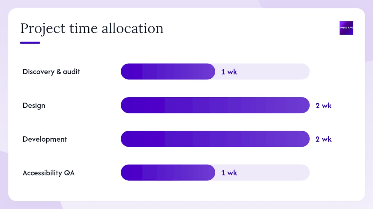
Implementation notes: The project ran over six weeks: one week for discovery and audit, two weeks for design, two weeks for development, and one week for accessibility QA and analytics setup. The tech stack was WordPress with a custom block theme, GSAP for the variable font animation, and Cloudflare for edge caching. The most time-consuming task was the accessibility audit and remediation — not the visual redesign.
Lesson learned: Accessibility fixes and performance optimization delivered more measurable lift than the visual redesign alone. The kinetic headline contributed to brand differentiation, but the conversion rate improvement was driven primarily by faster load times and a clearer CTA hierarchy.
Pro Tip: Start every redesign project with a full accessibility and performance audit before touching the visual design. The audit findings often reveal conversion problems that no amount of visual polish can fix.
Website design for local service lead generation follows a consistent pattern: performance and accessibility first, then visual differentiation layered on top.

Why chasing trends without a conversion strategy is the fastest way to waste a redesign budget
The most common mistake in 2026 web projects isn’t using the wrong trend. It’s using the right trend for the wrong reason.
Kinetic typography on a pest control site can work — but only if the animation serves the headline’s conversion purpose, not the designer’s portfolio. Organic layouts look impressive in award galleries, but a local plumber’s site with overlapping elements and no clear CTA path will lose leads to a simpler competitor site every time.
The teams that get the best results from 2026 trends share one habit: they define the primary conversion goal before opening Figma. The trend is a tool for achieving that goal, not the goal itself. A barely-there UI that reduces cognitive load and gets users to a contact form faster is worth more than a cinematic 3D hero that earns a design award and converts at 0.8%.
The Awwwards design community consistently validates this: the sites that win both awards and business results are the ones where interactions support the concept rather than perform for the designer. That’s the standard worth holding yourself to.
Restraint is also a competitive advantage for local service businesses specifically. When every competitor site is cluttered with stock photos, generic blue palettes, and auto-playing videos, a clean, fast, accessible site with a clear value proposition stands out without trying to be clever.
City Web Company builds websites that convert, not just impress
Local service businesses don’t need award-winning design. They need a site that loads fast, earns trust in the first five seconds, and turns visitors into phone calls and form submissions.

City Web Company’s web design and development service applies the 2026 trends that actually move the needle for local businesses: performance-first builds, accessibility compliance, nature-inspired visuals that signal trust, and conversion-focused layouts built around your specific service area. Every project starts with a full audit of your current site’s performance and accessibility gaps, so the redesign fixes what’s actually costing you leads.
If your site is slow, inaccessible, or just not converting organic traffic into contacts, the next step is a straightforward one: get a website design consultation and see exactly what’s holding your current site back.
Sources
These resources back the claims in this article and are worth bookmarking for ongoing reference.
- Web Design Trends 2026: What’s In and What’s Out | Bubble
- Top Web Design Trends for 2026 – Figma resource library
- Magnetic Commerce: Building the Dash Creative Website | Codrops
- 50 Best Website Design Examples: A Curated Collection by Designers, for Designers
- Winning websites. Web Design Inspiration – Awwwards
- Top Web Design Trends for 2026 – Designmodo
The best design resources are the ones you return to during a project, not just before it. Keep Awwwards and Eleken open during design sprints; use Figma’s resource library and Codrops case studies during development.
FAQ
What are the current trends in website design?
The leading website design trends in 2026 are kinetic typography, barely-there UI, Machine Experience readiness, nature-inspired tactile realism, purposeful 3D, and performance-first mobile design. Accessibility has moved from optional to foundational across all project types.
What are the new website design trends for 2025 and 2026?
Bento grids, variable fonts with scroll-driven animation, organic anti-grid layouts, and AI-driven progressive personalization are the patterns gaining the most traction. The shift away from generic AI-generated imagery toward warmer, human-made visuals is one of the clearest signals in current design work.
What are the 5 golden rules of web design?
Definitions vary, but the most widely applied principles are: prioritize performance (fast load times convert better than beautiful slow sites), design for accessibility from the start, establish a clear visual hierarchy, make every interaction purposeful, and test with real users before scaling. These apply regardless of which visual trend you choose.
What are the 7 C’s of web design?
The 7 C’s framework is not a universally standardized model; different sources enumerate it differently. A common version covers context, content, community, customization, communication, connection, and commerce. For practical 2026 projects, the more actionable framework is the performance and accessibility checklist covered in this article.
How do I apply website design trends without hurting conversions?
Define your primary conversion goal before choosing a trend, then test the trend on a single high-traffic page before rolling it out site-wide. Use the testing matrix in this article to set a hypothesis, a primary KPI, and an acceptable threshold before launch.
Recommended
These articles were popular with other readers too: